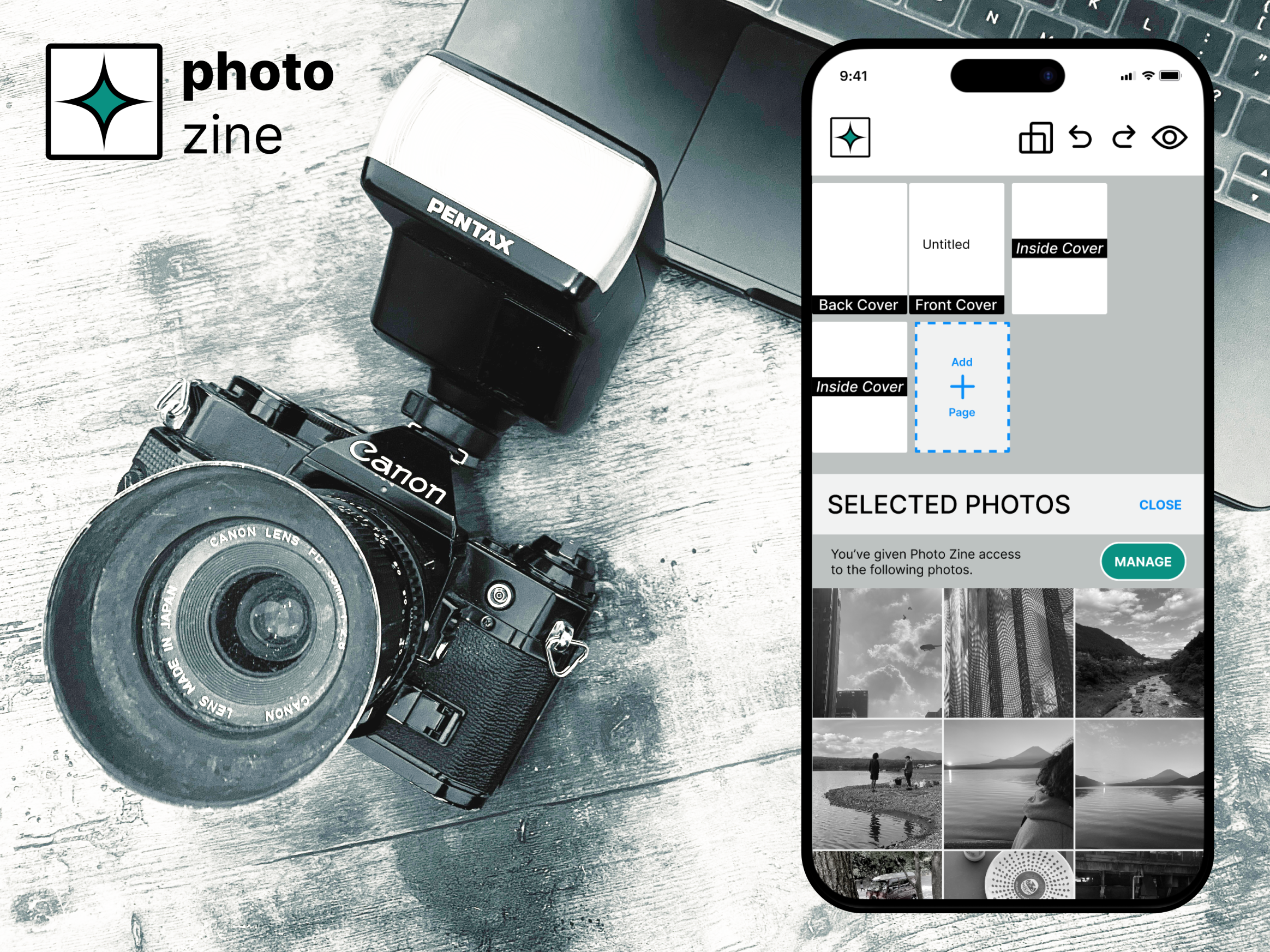
photozine
End-to-end mobile app

An end to end mobile app concept allows photographers to arrange and format photos for print in a zine or book.
Responsibilities
UX Researcher, UX Designer, UI Designer
Industry
Lifestyle
Date completed
Problem overview
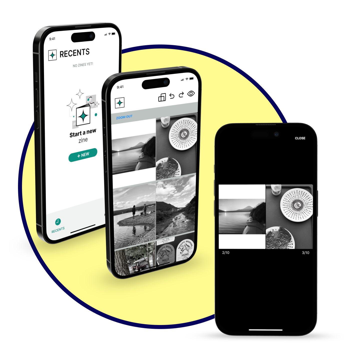
Artists and creatives ultimately want to spend time on their craft, not the administrative, logistical and rote aspects tied to it. For photographers, one challenge they encounter is formatting and sequencing their work for print. Photographers are inevitably tasked with navigating cumbersome or complicated software to print their work in a zine or book.
Proposed solution
A simple, user-friendly app that allows users to arrange and format their photos for print.
Discovery
What are the biggest road blocks for “Creatives”?
A (too broad) start
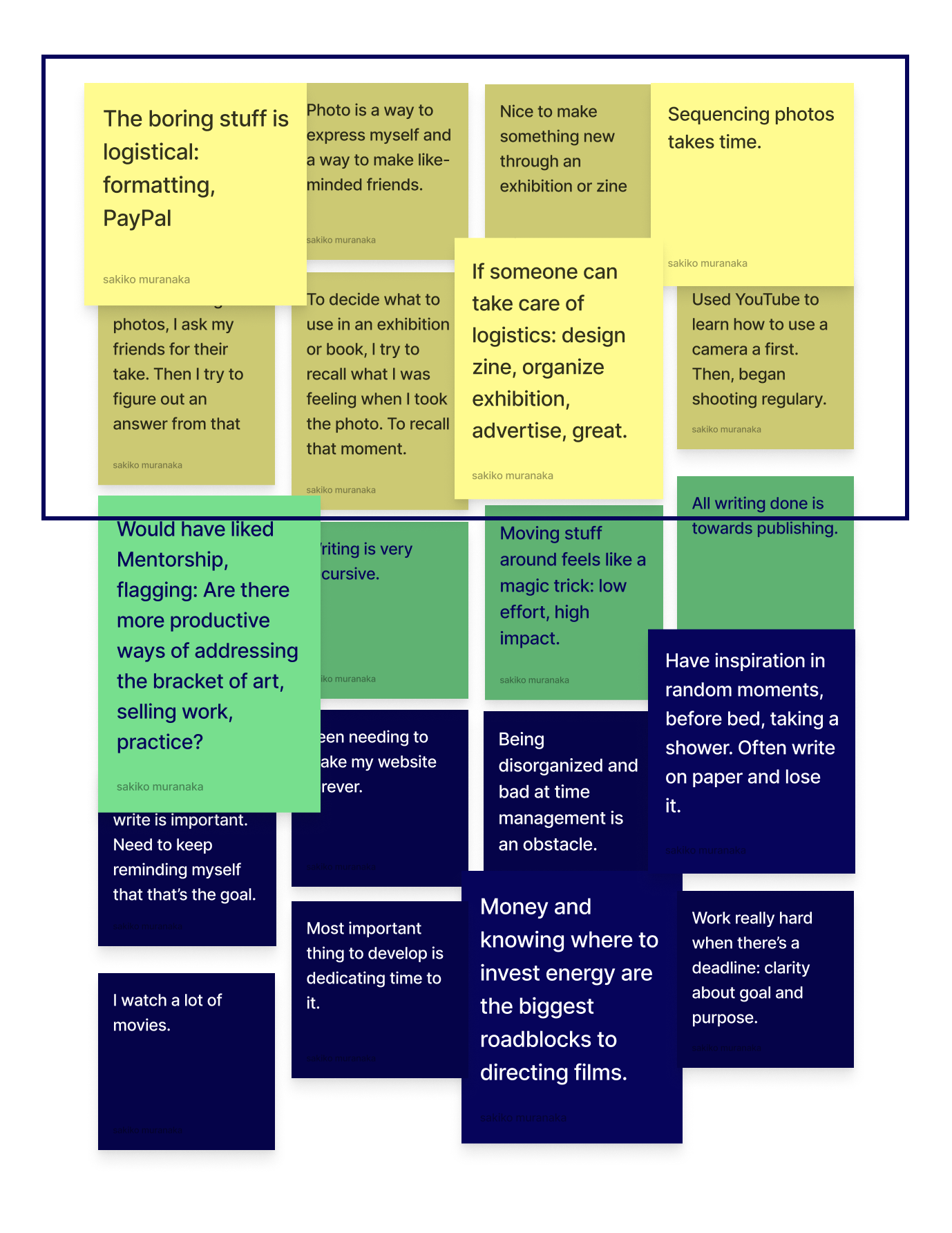
My research initially began with an investigation into how creatives, defined as those who create visual, literary or other work in a professional or personal capacity, establish a creative practice. I interviewed two photographers, a literary writer, and two screenwriter/filmmakers to see if I could pinpoint broader patterns.
 Interview notes
Interview findings reveal 3 trends
- It can be challenging to invest in the craft regularly
- It is important to consume other creative work
- Managing logistics slows down creative work
One logistical concern voiced by photographers was the challenge to compile work to showcase in a zine or book. One user didn’t know where to begin in the process and the other expressed frustration in the tedious work of formatting their photos in preparation for print. I decided that this problem would be my focus for this project.
Photographers struggle to compile their work for print in a zine or book.
The Competition
Competitive analysis findings
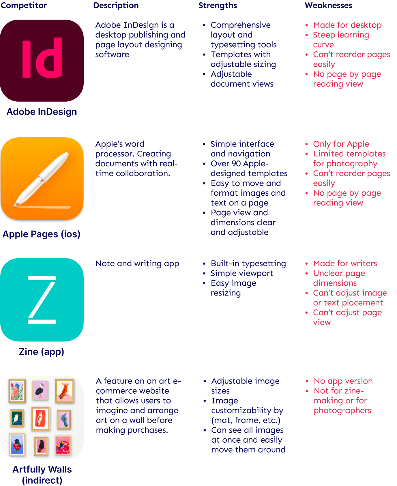
Direct competitors fell short in meeting the needs of the niche user: photo-zine makers. They tended to be too complex and not optimized for arranging and rearranging images. The indirect competitor allowed easy movement of elements, but was not designed for zine/book-making and was not designed for mobile.
A digital dummy zine that’s easy to use …
Also, keep in mind…
I conducted an additional interview with a photographer/ graphic designer who had independently curated and compiled photo books in Tokyo. The interview yielded the following observations:
- Photographers are not experts in visual design
- Printing in Japan is especially cumbersome
I noted these insights as I furthered defined users and considered a solution.
“Photographers are not graphic designers. They don’t know about design principles.” - Graphic designer
Define
Two kinds of photographers
As I gained a better understanding of the pain points of photographers, it was clear that “simple” was an important baseline, but that the app would also need to allow versatility for users with a strong vision and design background. I further defined my user through creating two personas, a “point of view statement” and a “how might we.”
Personas
I created two personas in consideration of interviewees: the self-taught photographer and the photographer with a design background.
POV 1
Photographers need a way to easily format their work for print.
HMW 1
How might we make it easier for photographers to format their photos for print so they can focus on their craft?
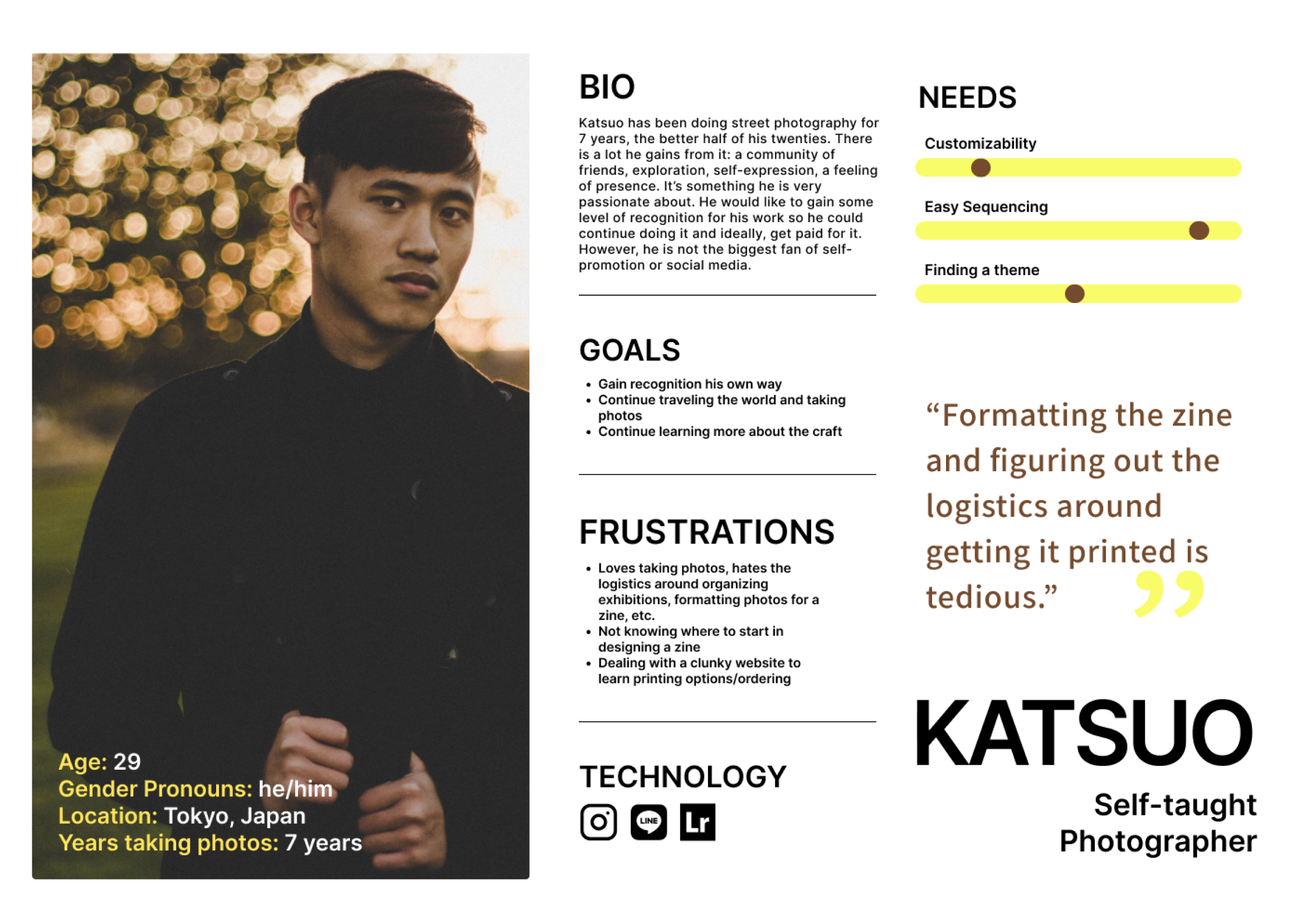 Persona 1: Self-taught photographer
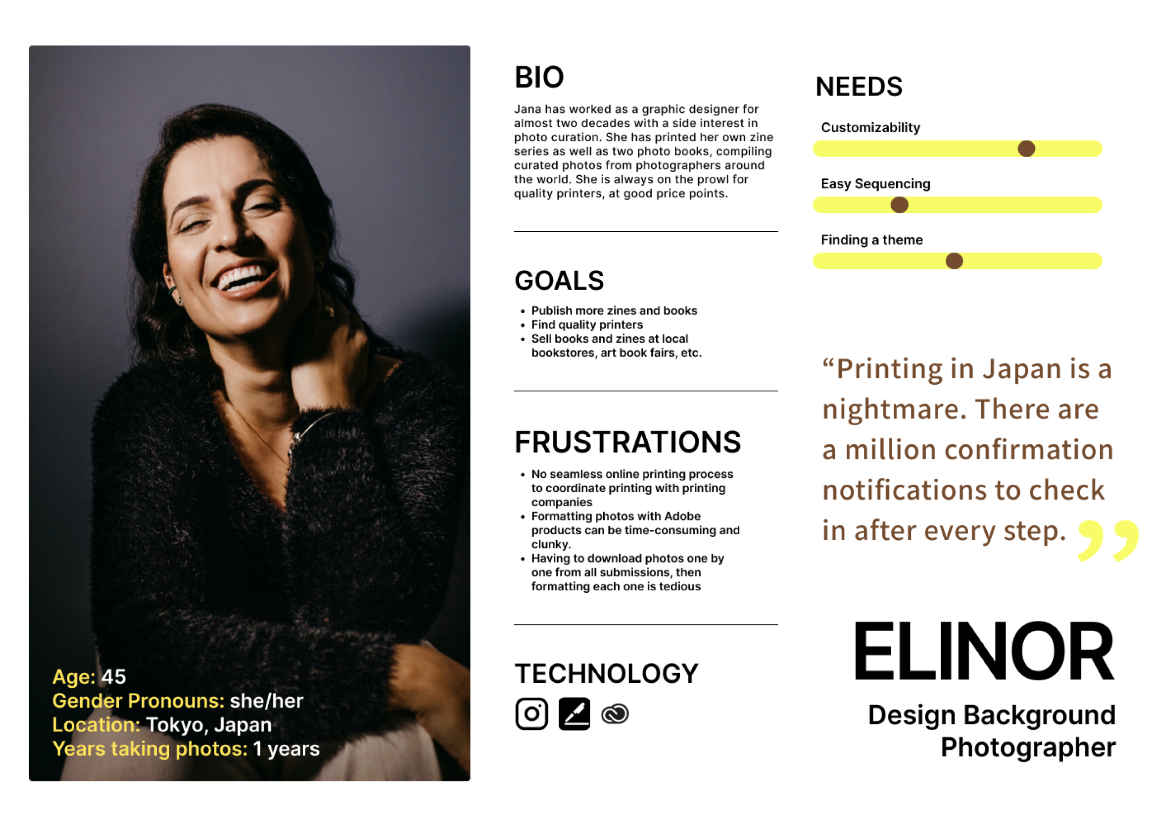 Persona 2: Design Background photographer
How might we make it easier for photographers to format their photos for print so they can focus on their craft?
Ideate
Easy, breezy, and customizable
Our solution was a photo zine app that would be easy to learn, simple to use and emphasized moving and formatting photos for the layman photographer, while also allowing sufficient customization features for the seasoned graphic designer.
Three viewports and simple tools
I drew up a feature set, with a must have, nice to have, surprising and delightful and can come later sections and determined that the “must have” features would be in scope for this project.
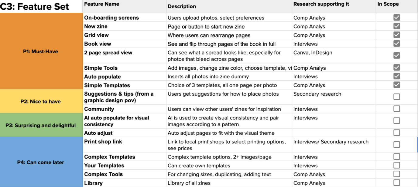 Feature set
MVP: Create, Edit, & View
I determined that the MVP for this app would allow users to quickly mock up a layout for their zine, edit pages to their liking, and view a prototype of what the zine would look like as a printed book, cover to cover.
I created flows for the following three tasks:
- Starting a new project
- Editing zine pages
- Viewing the zine as a book
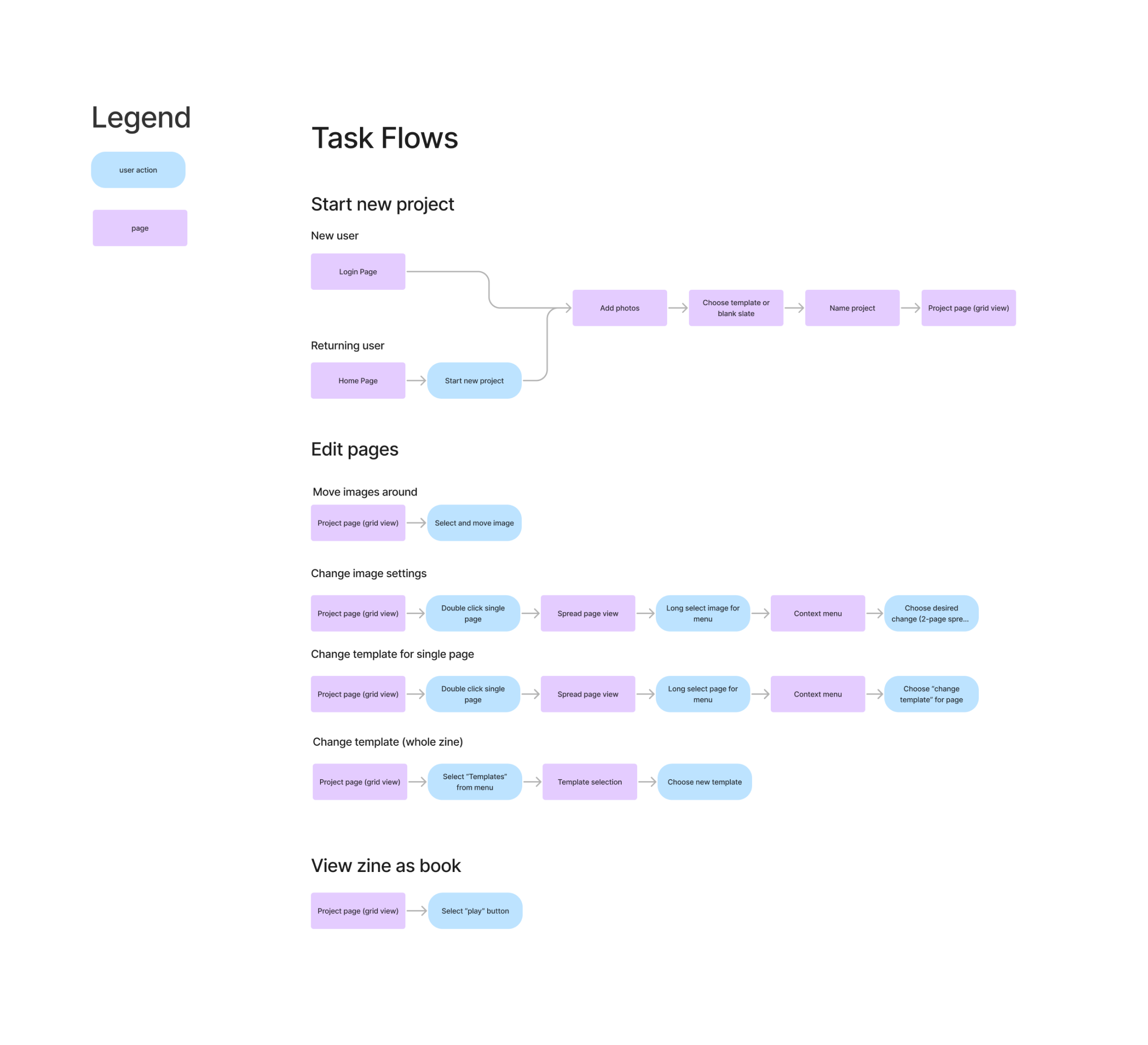 Task flows
Branding for analog lovers living in a digital world
Considering my target users, I wanted branding that would appeal to the analog film photographer while also bringing in a modern touch, emphasizing ease of use. I narrowed down brand values using a uniqueness and “on-brand” matrix. Then, I landed on a brand name that was straight forward: photozine.
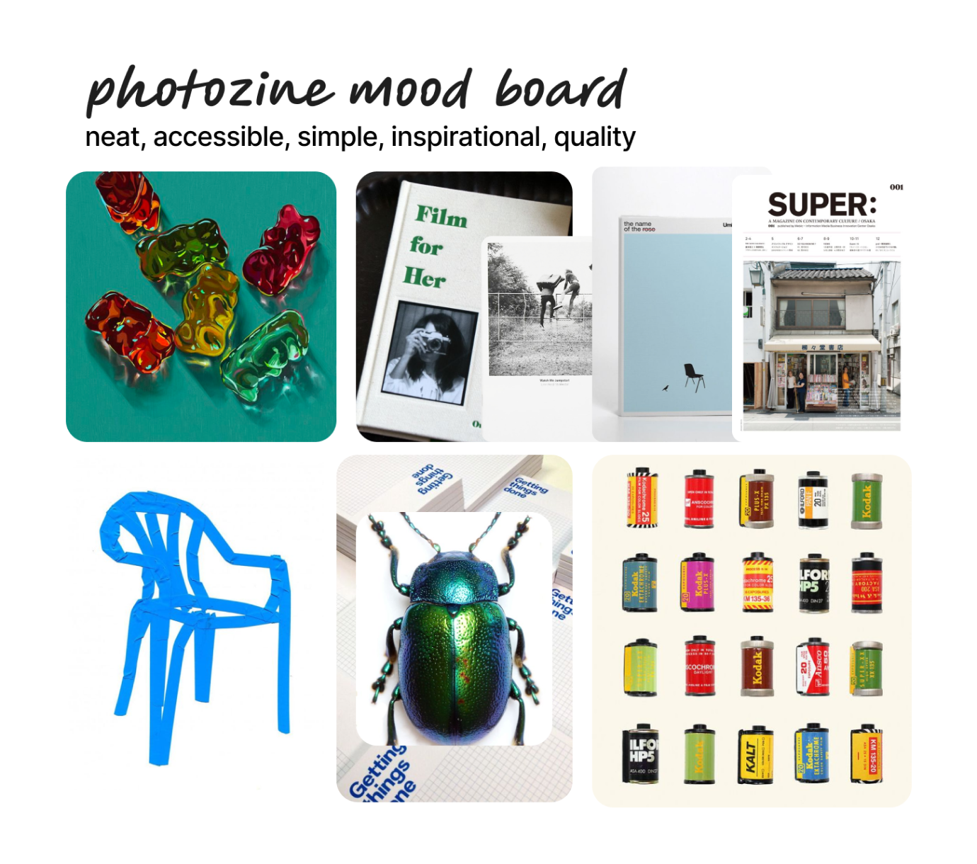 Mood board
Mood: Contemporary with a touch of nostalgia
After landing on the brand values of neat, accessible, simple, inspirational and quality, I chose a product name and began constructing a mood board. The mood captured is contemporary, while also calling to the past. There are elements of adventure and intrigue as well as neatness and uniformity.
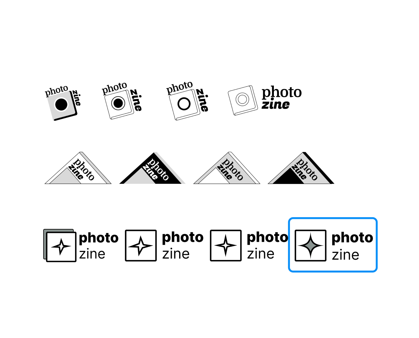 Logo brainstorm
Logo: Cameras, magazines, photos
I brainstormed ideas based on brand values, and decided on the final logo style. The first two variations made a nod to magazines and cameras, but ultimately came across as dated. The logo I chose was simple, clean and received the most positive feedback.
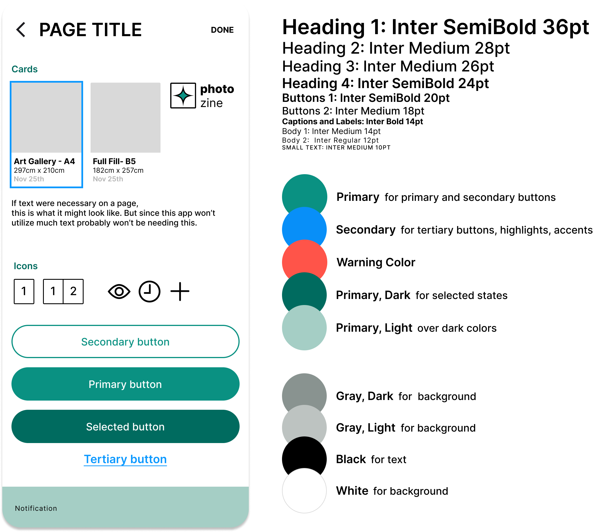 UI Kit and Style Tile
UI Kit and Style Tile
I pulled colors from the mood board and decided on a palette that embodied newness and nostalgia. The font styles are clean and neat. Icons maintain clean, medium weights.
Evolution of Wireframes: a quest for intuitive, clear flows and a streamlined toolkit
I started my wireframes in digital lo-fi flows, where I began working with layouts for each page. Digital made the most sense since the app would feature different viewports for photographs, all of which would need to be uniform. I wanted to make sure that functions were clear and intuitive in lo-fi before moving on to hi-fi frames. In every iteration, I pared down toolbar items, considering what would be absolutely necessary for the MVP.
Low Fidelity Wireflow: Eye on simplicity and function
In lo-fi, I focused on user flows. I created page layouts with simplicity and function in mind and iterated on lo-fi frames until the app’s primary functions were clear.
Flow 1: Create new zine
Users upload and select photos, choose a template, and their zine auto-populates in “Grid view”with selected photos. The decision to have images auto-populate a template put emphasis on what I saw as the most vital components of compiling a photo zine: sequencing and formatting photos.
Flow 2: Sequence photos, customize pages
The second flow considers interactions that allow users to sequence and format images. Users are able to see their zine in a “zoomed in” viewport and can make edits to images through a dropdown context menu.
Flow 3: View zine as a book
The third flow allows users to see how their choices come together in a digital prototype of their zine.
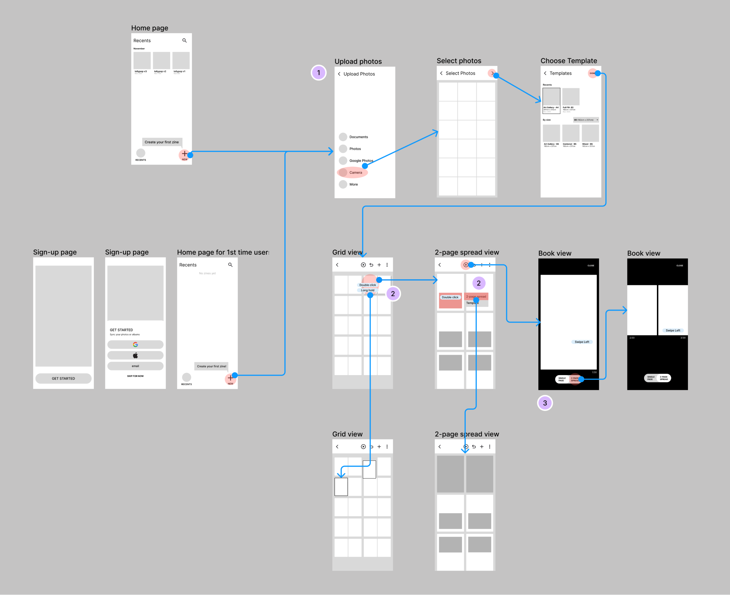 Lofi wireframe
The decision to have images auto-populate a template put emphasis on the most vital components of compiling a photo zine: sequencing and adjusting photos.
Hi-fi Frames: Fine-tuning features
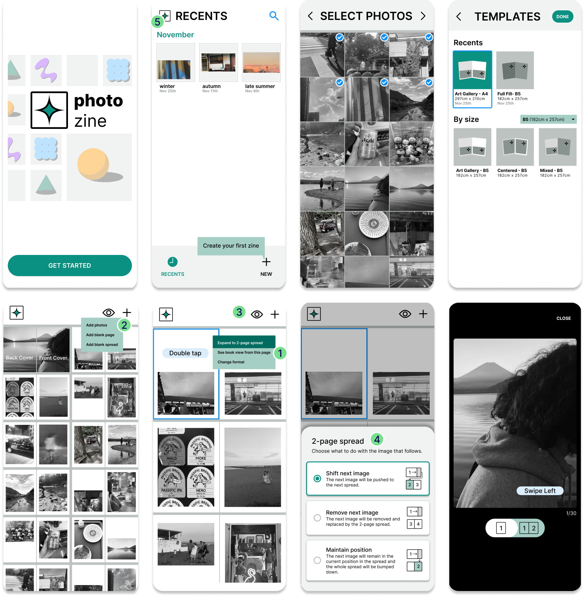
I went straight to hi-fi frames, where I inserted branding components and content. After receiving feedback on version 1, I edited the toolbar to remove anything unessential to the MVP and further fleshed out the functionality of remaining toolbar items.
Design decisions:
- Book view from a selected page
- “Plus button” features
- Streamlining tool bar: I eliminated the “more” button option, which competed against the “+” button and decided to embed an “undo” button in the edit flow instead of keeping it in the toolbar. These edits flatten the toolbar, which lead to a clearer, more intuitive user experience.
- Options modal for switching photo format: I added a modal, which would allow users to understand how their choice would impact the subsequent page layout before committing to the edit. This gives users a sense of control over their choices.
- “Home” button instead of back arrow on grid view
Deliver
Flexibility is key, not necessarily having more options
Usability testing with new and experienced zine-makers
I conducted usability tests with three participants. Two were part of the target demographic, photographers, and had prior experience making a zine. One participant was not a photographer, but came from a design background. By having users with previous zine-making experience and someone without, I could understanding how seasoned and potentially new photographers might respond to the product. I could also get insight into a designer’s logic.
Research Goals: Intuitive, customizable, efficient, appealing?
- Ease of Use: How intuitive is the app? Can users do what they need to do?
- Template Customization: How do users feel about the tools provided to customize images in their zine?
- Workflow Efficiency: How easily can users format images? Any frustrations?
- Visual Appeal: How do users feel about the UI? How do users feel about the zine they make with the app?
Test Results: Intuitive to use, customizability to be desired
Task Completion Rate: 3/3 participants struggled with the prototype itself, but were able to complete each task successfully.
Error Rates: All participants struggled when it came to the task of formatting images. Most frequently would try to grab an image to reformat. It was not intuitive for them to see a context menu to make image adjustments.
User Satisfaction Scores: Ease of use hovered at an average of 3.7. Of primary concern was lack of image customizability.
Feature utilization: The most useful feature was being able to move images around and being able to reformat them.
“Kumiawase (ability to combine / arrange freely) is very important”- Target User
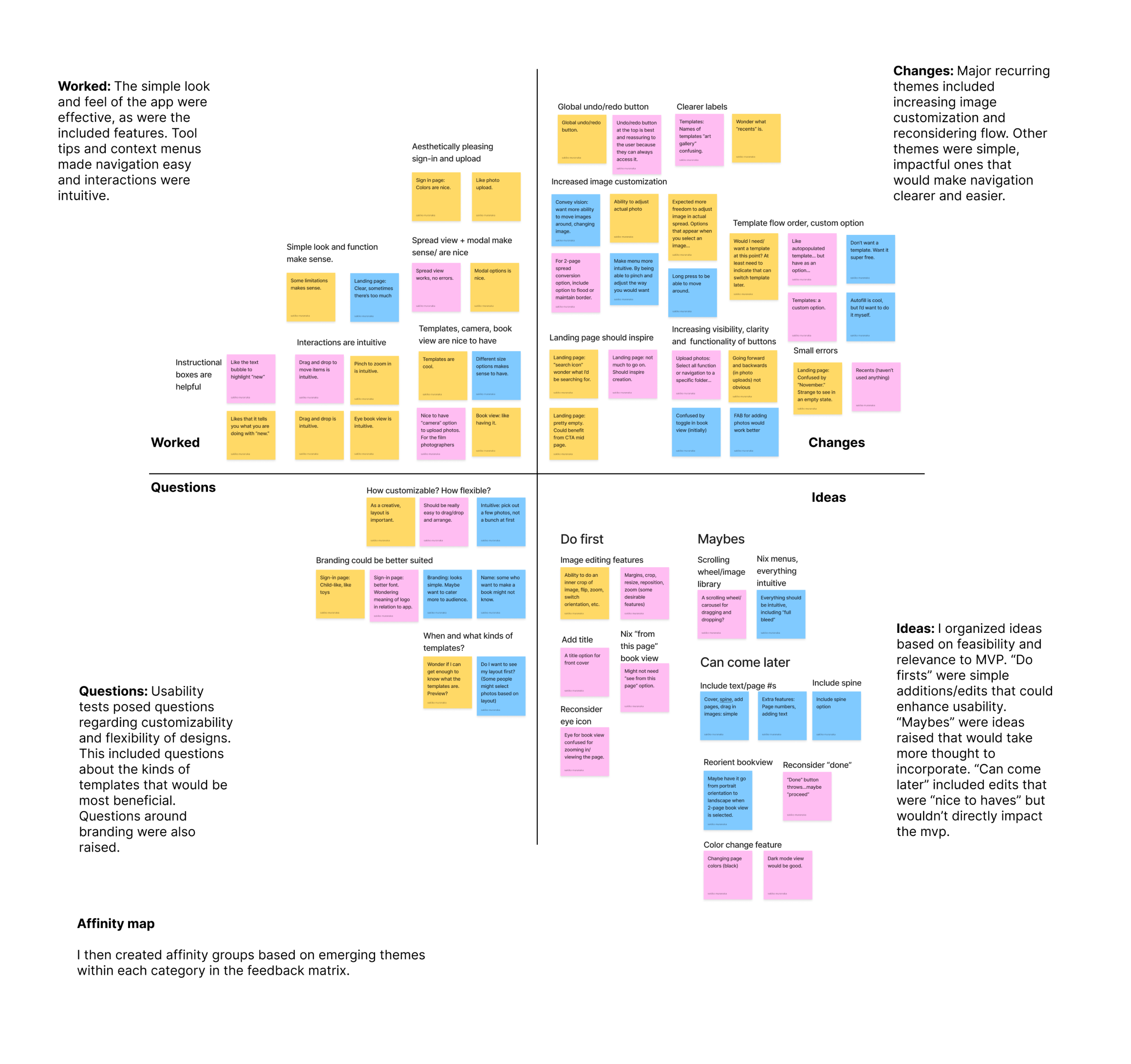 Click for close up of Usability Test Results: Affinity Map
Affinity mapping and frequency-severity matrix lead to two major priority revisions: improve image customizability and reconsider flow.
1. Improving customization & intuitiveness
V1: The most consistent feedback I received, was in regards to image customization. 3/3 users reported a desire for more flexibility around image customization. In V1, users were confined to chosen templates, with little room to adjust image size and image location on a given page. A temporary undo button left users feeling limited in their explorations.
V2: In V2, users can customize image size and placement by pinching the screen, which makes editing more intuitive. Modals and context menus were removed to allow for uninterrupted, intuitive exploration. A global undo and redo button were placed in the toolbar to provide users with security: they can explore as much as they like and return to earlier versions as needed.
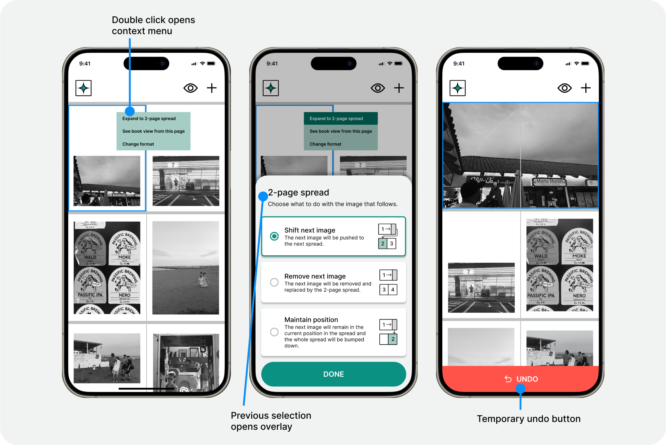 Prototype v1, Image customization
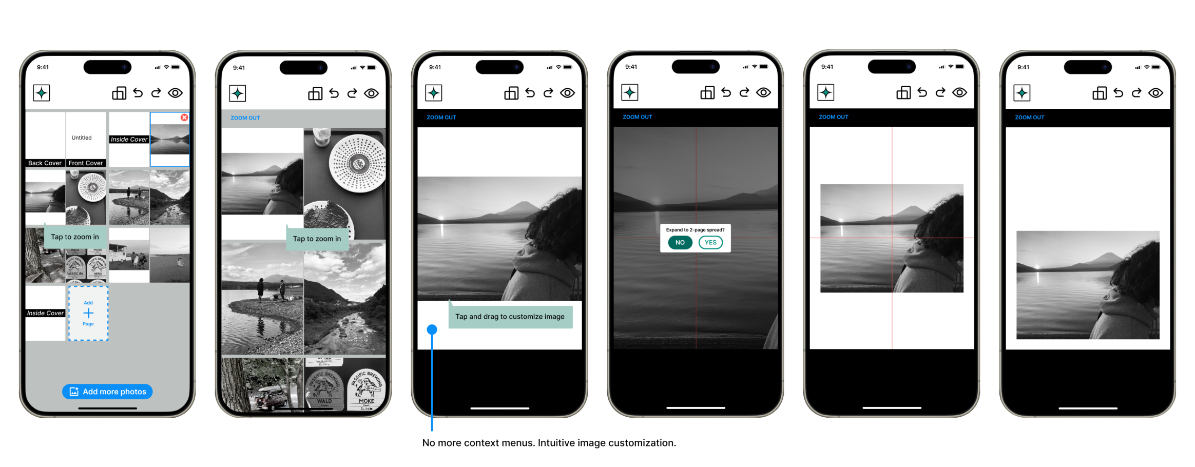 Prototype 2, Image customization
2. Reconsidering flow
V1: 3/3 users raised concerns and considerations regarding the template option in the “new zine” flow. One user noted: they would consider zine orientation before selecting images. The third user, the non-photographer, noted that there might not be enough to distinguish one template from the next. Although all three users voiced an appreciation for an auto populate function, 2/3 users also voiced their desire to be able to “drag and drop” images into frames on their own.
V2: The feedback led to my decision to remove the templates page altogether. I realized it wasn’t serving the MVP. Instead, I decided to include a “page orientation” option in the toolbar, garnering the importance of this feature. I also brought the photo library onto the zine grid view page, which would provide users the freedom to select and “drop” images into their zine instead of having images auto populate a chosen template. Although this iteration takes out page sizing, I decided that it ultimately wasn’t essential to the MVP.
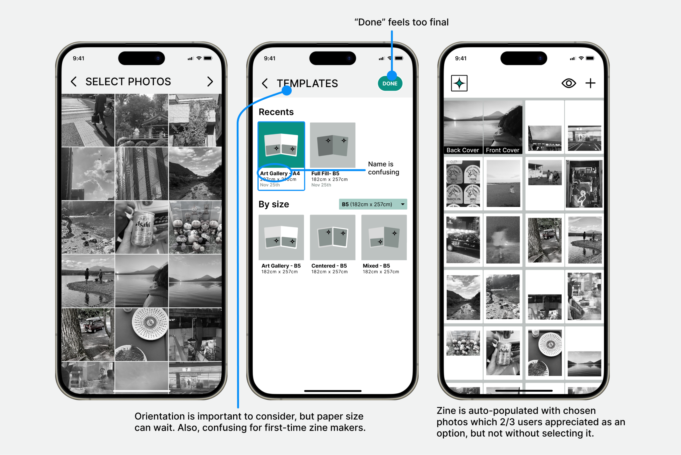 Prototype V1 “Create New Zine” flow
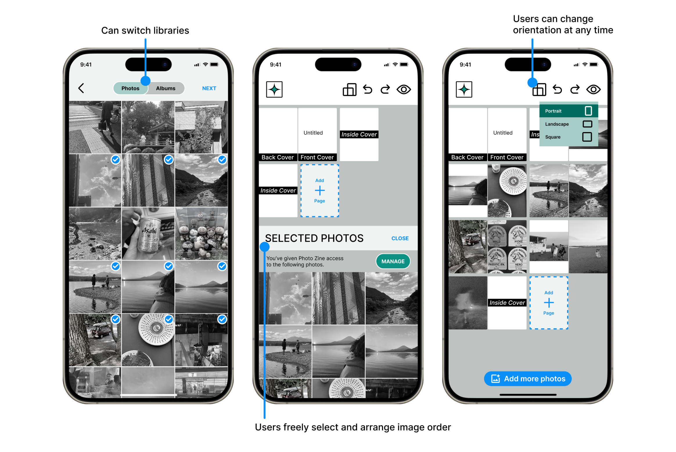 Prototype V2 “Create New Zine” flow
3. Creating an inviting landing page
V1: 2/3 users were underwhelmed by the initial landing page. There was an appreciation for the minimalist aesthetic, but a desire for a bolder, more obvious invitation to create a zine. The “November” label also confused one user as did the the “search” icon, which prompted the question: “what would I need this for?” 3/3 users appreciated the tooltip prompting users to create their first zine.
V2: The second iteration removes the November label, the search icon (for later), and makes use of the blank space by introducing a visual with CTA.
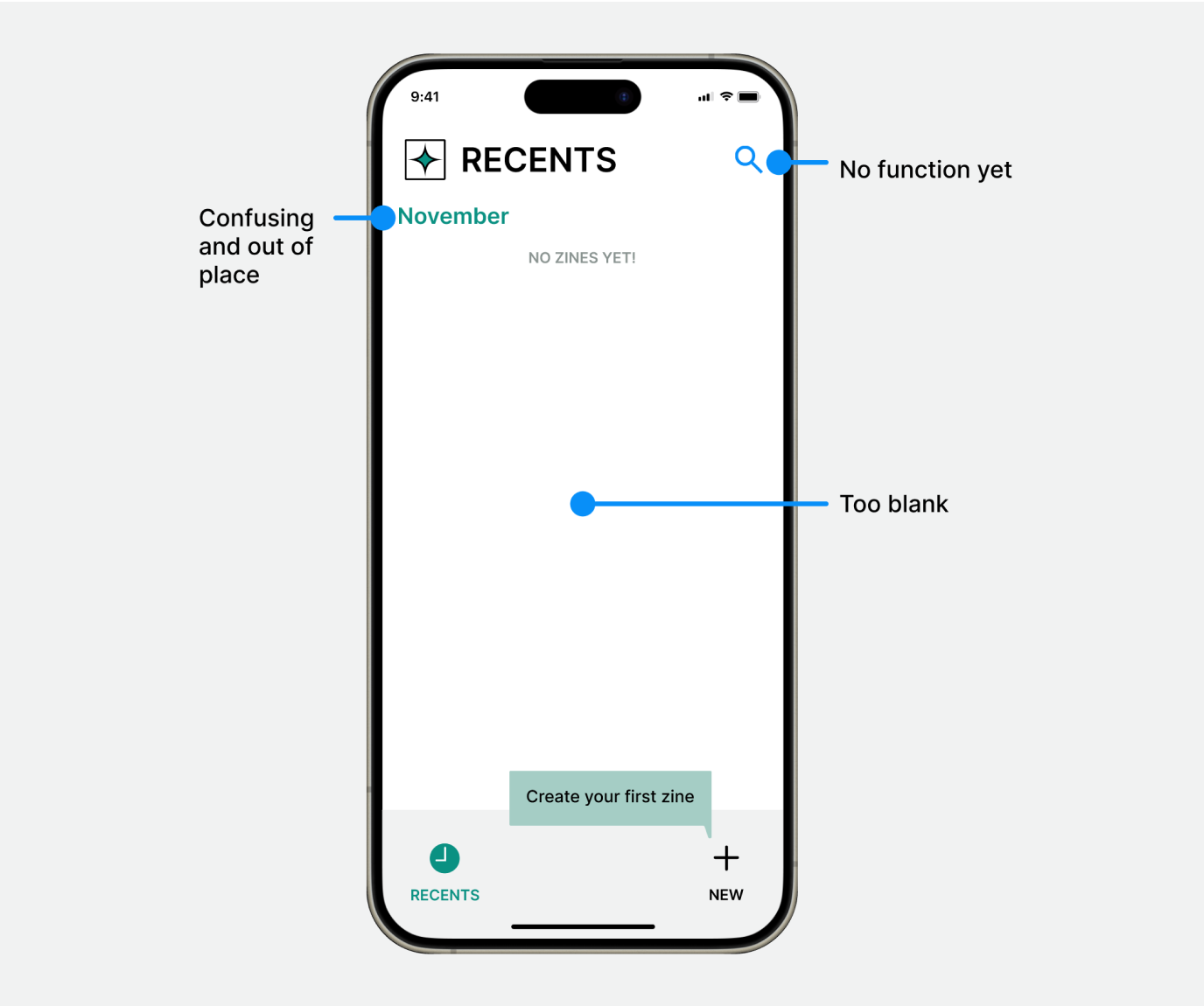 Prototype V1, Landing Page
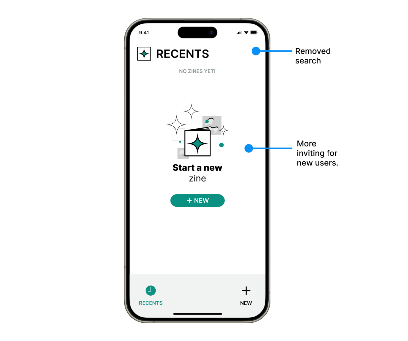 Prototype V2, Landing Page
4. Improving visibility and usability
Minor edits were needed to clean up errors, improve button visibility and usability. I decided to maintain the “eye” icon and clarify its function with a tooltip. I also added tooltips throughout the flow to introduce users to all the built-in features.
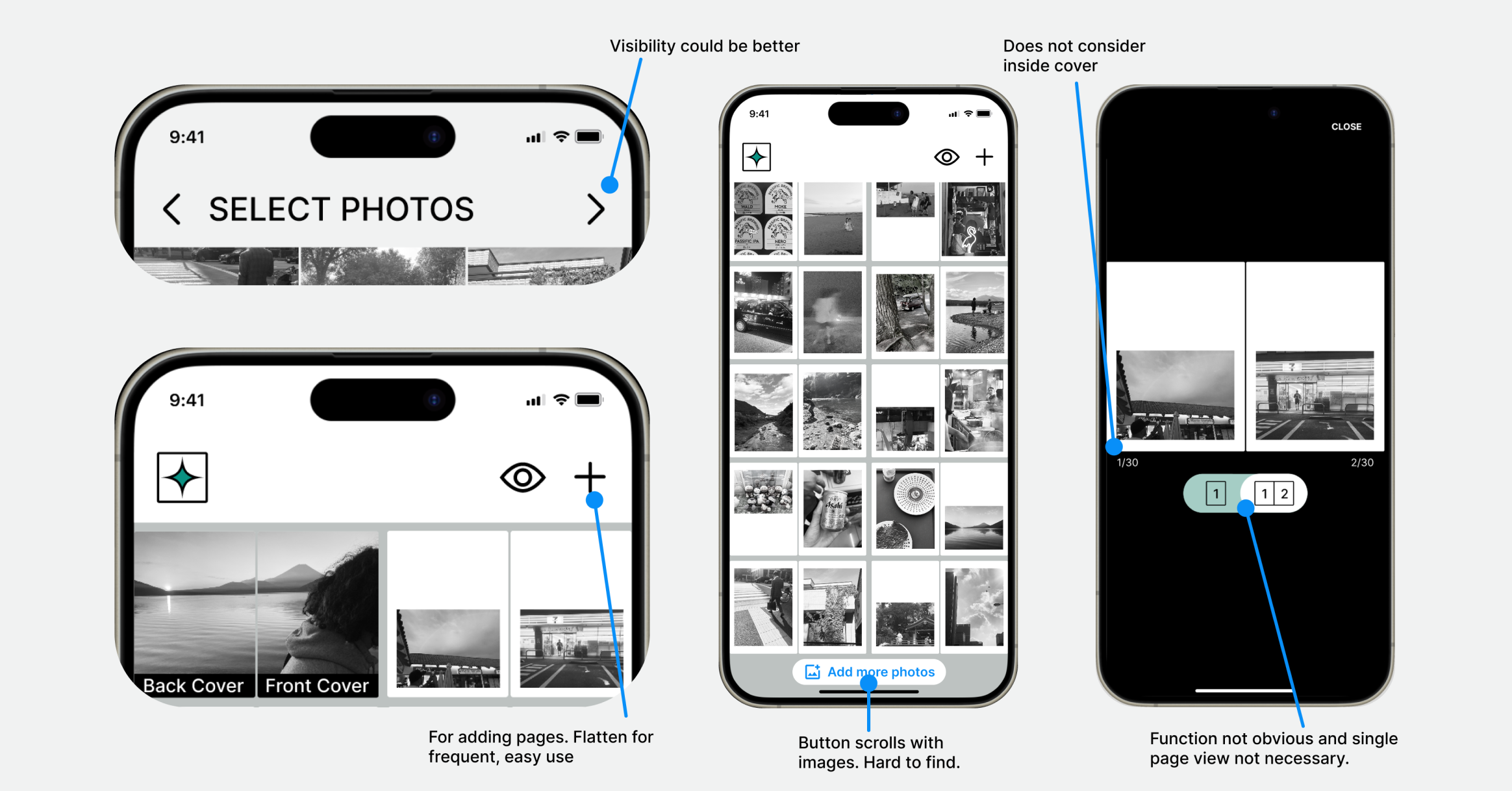 Prototype V1, Features and buttons
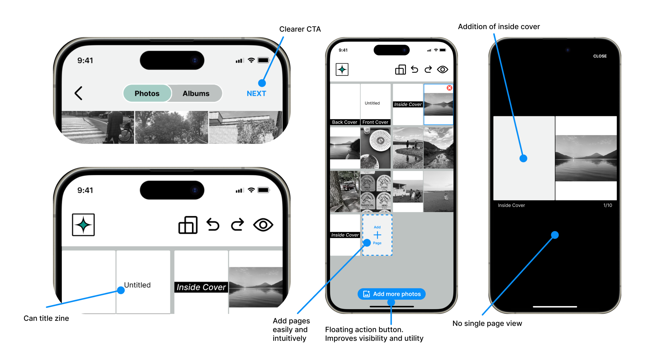 Prototype V2, Features and buttons
Users want simple tools with lots of room to play.
Final synthesis
Conclusion
If I had more time…
Given more time for this project, I would have liked to iterate on branding. Although the clean and minimal aesthetic seem to work, the logo design could use a revisit in order to better suit the app’s target demographic. I would also have liked to test V2 of the prototype to see what improvements could be made to the new design.
Going forward, I would want to consider additional features, beyond the MVP. In particular, since a major pain point for users interviewed were in regards to the printing process, I would be interested in developing a flow that helps take the mock-up zine to print.
What I learned
Reflecting on my design process, most of my learning came from the research phase. I learned the importance of making sure to match interviewees with target demographic as closely as possible. I made two mistakes on this front: my interviewees in discovery (creatives WITH experience) did not match the target demographic (creatives with little to no experience) and my interviewees were split across mediums (two photographers, three writers). I realized that research is much more effective and can lead to stronger conclusions when the audience is focused.
Thanks for taking the time to look through this case study!
