Ministry of Foreign Affairs (MOFA) Japan
Redesigning a responsive webpage for a government website

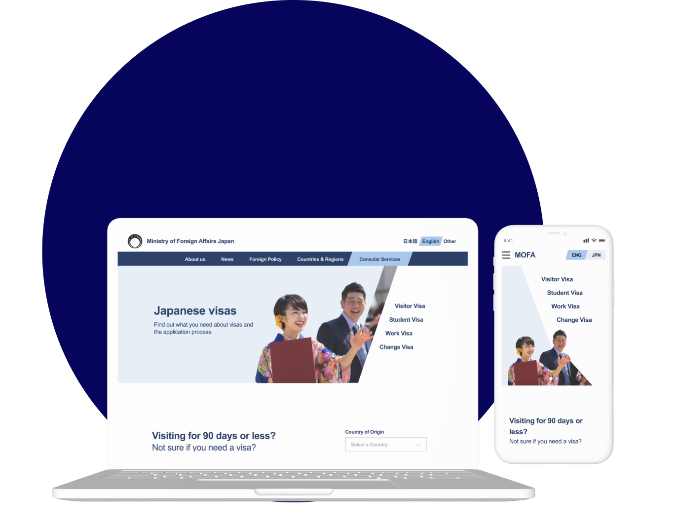
A redesign of Japan’s Ministry of Foreign Affairs (MOFA) visa information page reimagines information architecture and visual hierarchy. The updated design allows users to navigate the site with ease and confidence.
Responsibilities
Research, UX/UI Design
Industry
Government
Date completed
Problem overview
Being able to navigate a country’s visa information site is integral for prospective travelers and residents. My own frustrations navigating Japan’s Ministry of Foreign Affairs (MOFA) led me to this project.
MOFA’s visa information page overwhelms users with poor information architecture and visual hierarchy. Users leave the site doubtful and uncertain of how to proceed.
Proposed solution
A restructured MOFA visa information page that allows users to find the information they need and proceed with confidence.
Discovery
Where and how do people get their visa info?
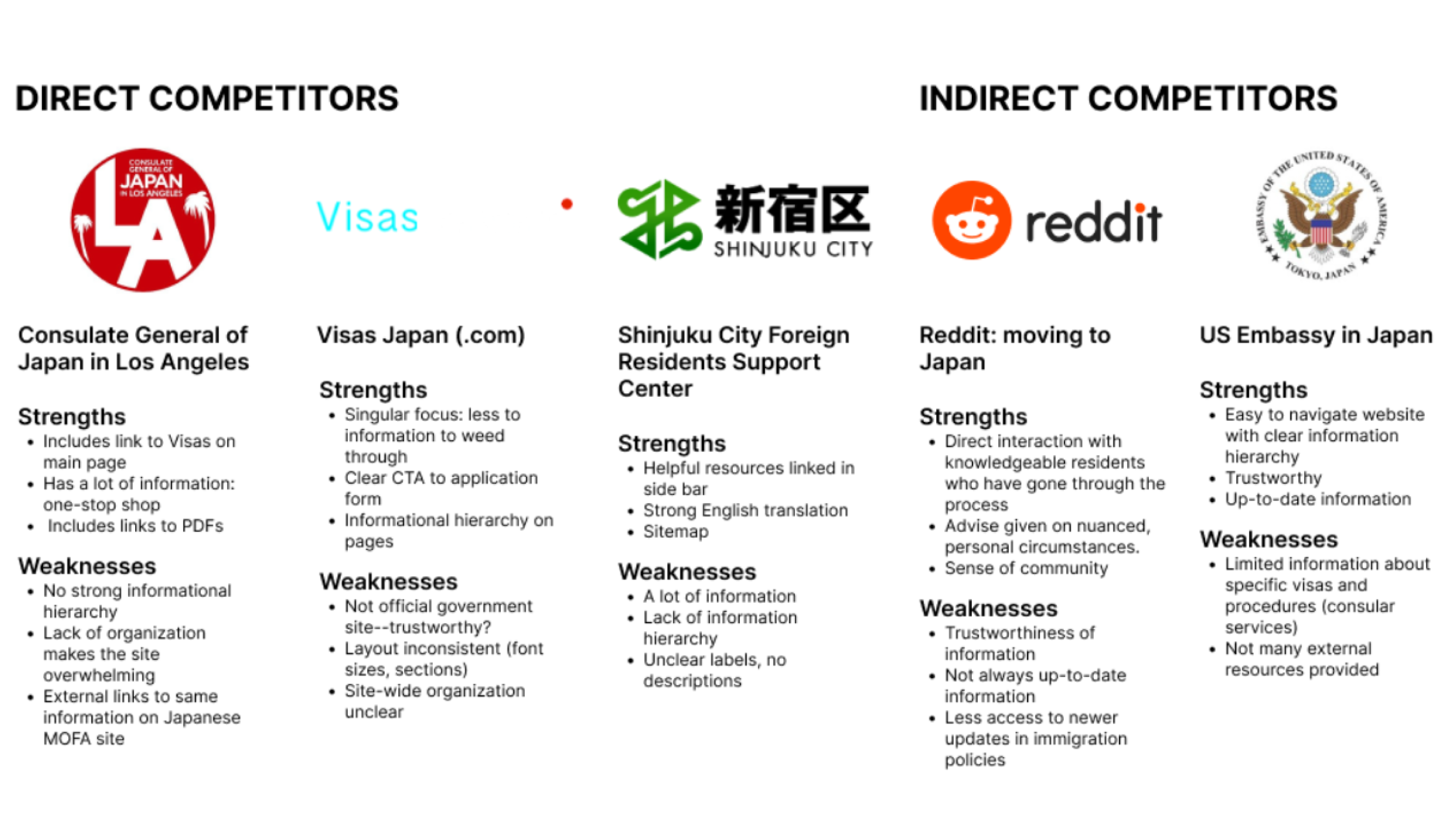
In order to understand where other visa info sources succeed and where they face limitations, I began with a competitive analysis of 3 direct and 2 indirect competitors. I then conducted preliminary usability tests for the current MOFA visa site to better understand where users struggled.
In the research it became clear that the process of obtaining a visa in Japan is inherently complicated, with detailed steps that differ according to each applicant. The Japanese sites had similar strengths and weaknesses as the MOFA site.
 Comparative analysis
Same issues across Japanese Government Sites

Preliminary Usability Tests: Confusion and Frustration
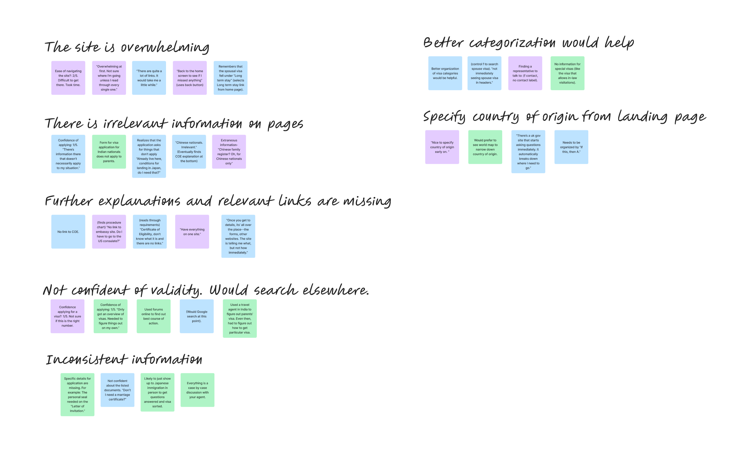
I conducted a preliminary usability test of the MOFA site as is to learn more about where and how information architecture goes awry for users. 4 users, all between 25-37 years old were asked to navigate the MOFA website, given a particular visa need, such as finding out where and how to submit a visa application or finding out which visas they qualify for.
 Click to view close-up of Affinity Map
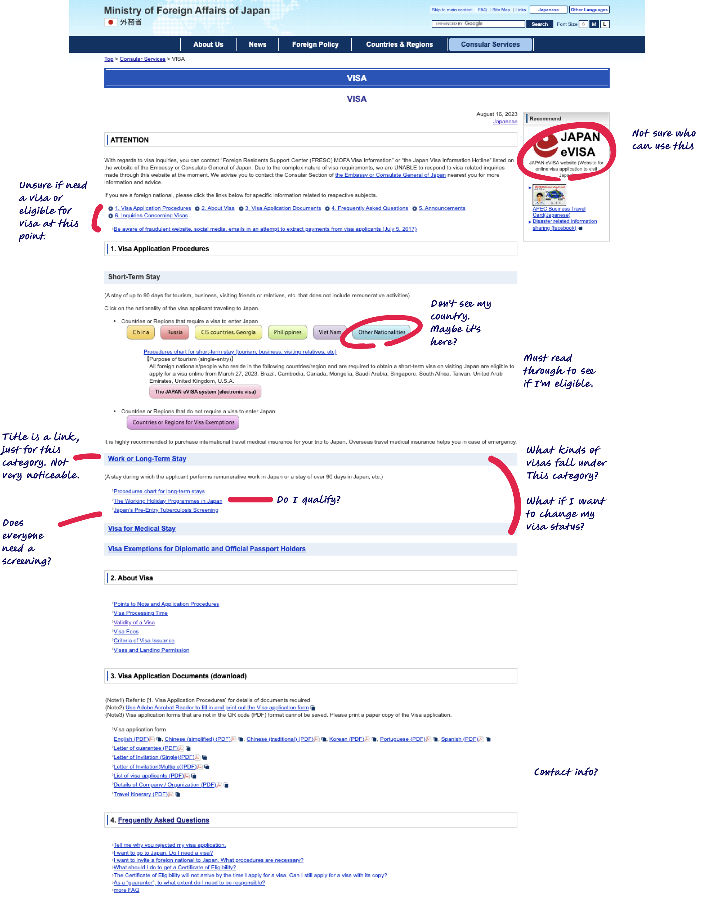
Original Visa Landing Page
Usability test findings
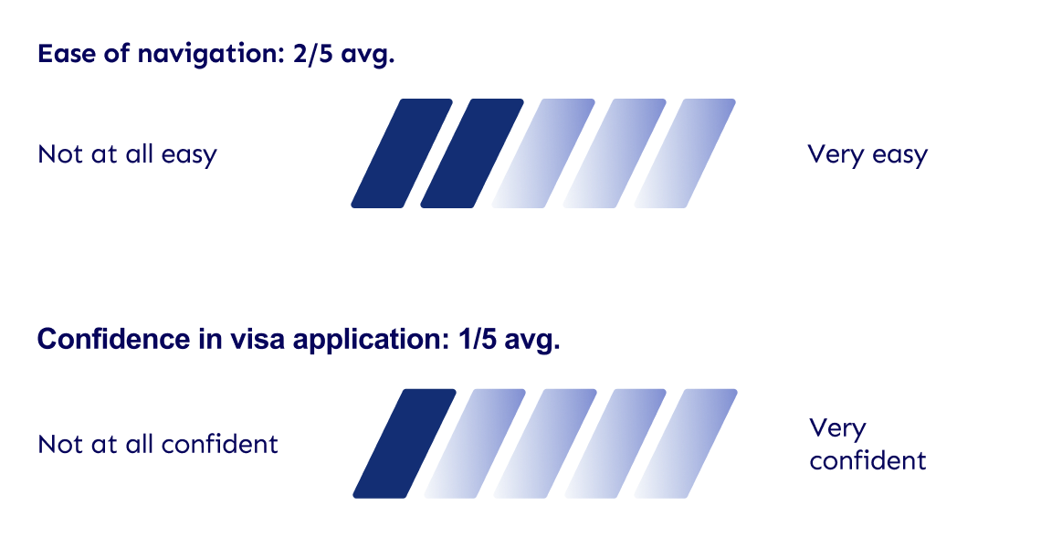
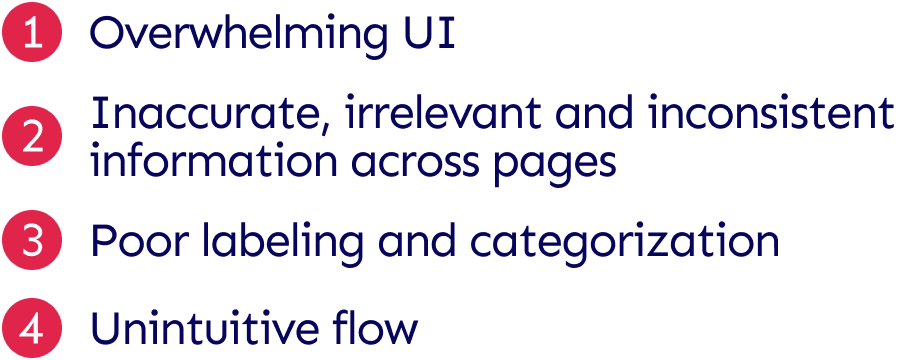
Users found it difficult to navigate the site and ultimately lacked confidence in the information they obtained from it.
Primary pain points
Users struggled with navigation and lacked confidence in the information they found.
Define
Search pathway defined by status of residency
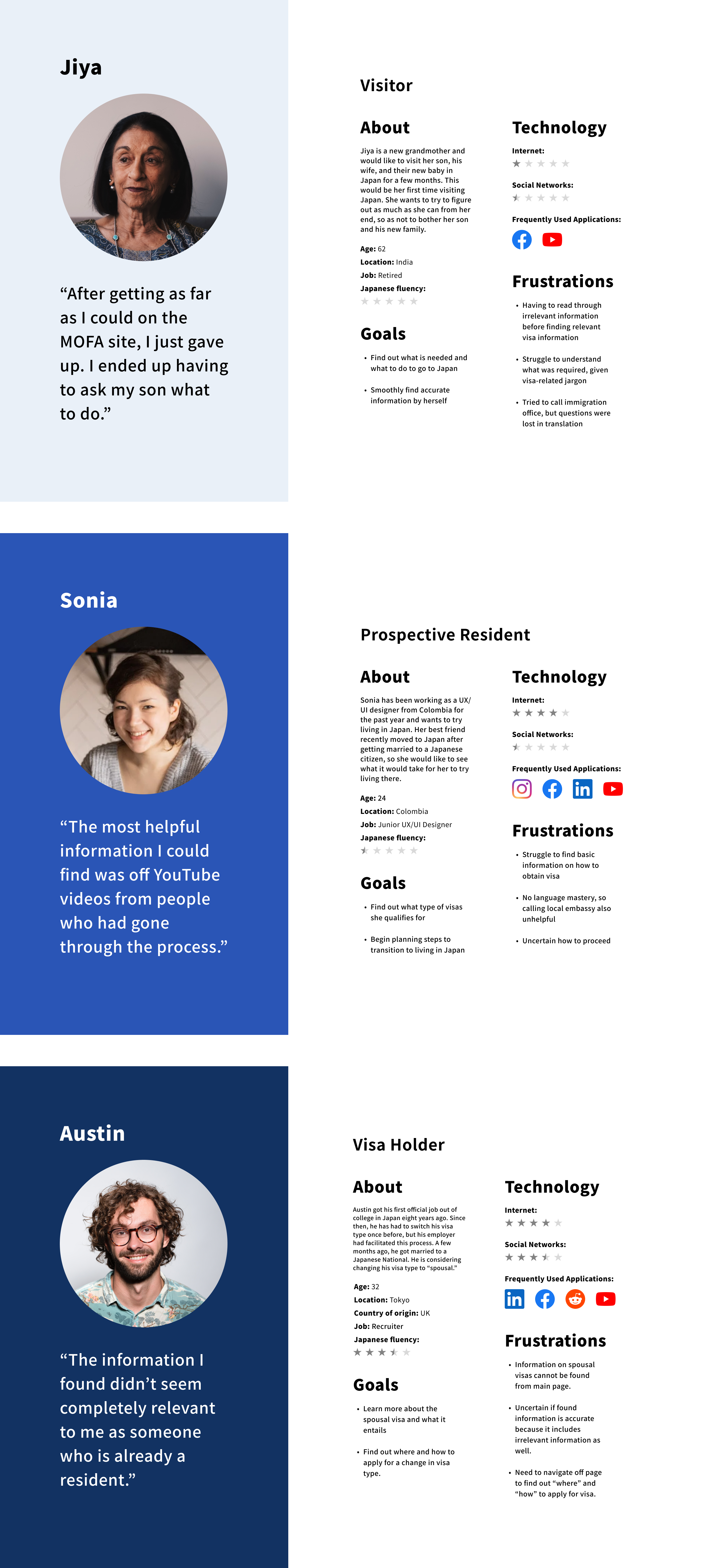
I came up with a “How Might We” question based on research findings to further define the problem. Then, I thought about personas based on findings from preliminary usability tests. The tests revealed differences in search pathways according to type of visa each participant was searching for as well as the status of the resident. I took both factors into consideration for the personas I constructed.
How might we be able to restructure the information architecture of the site in order to reduce the burden of search on users?
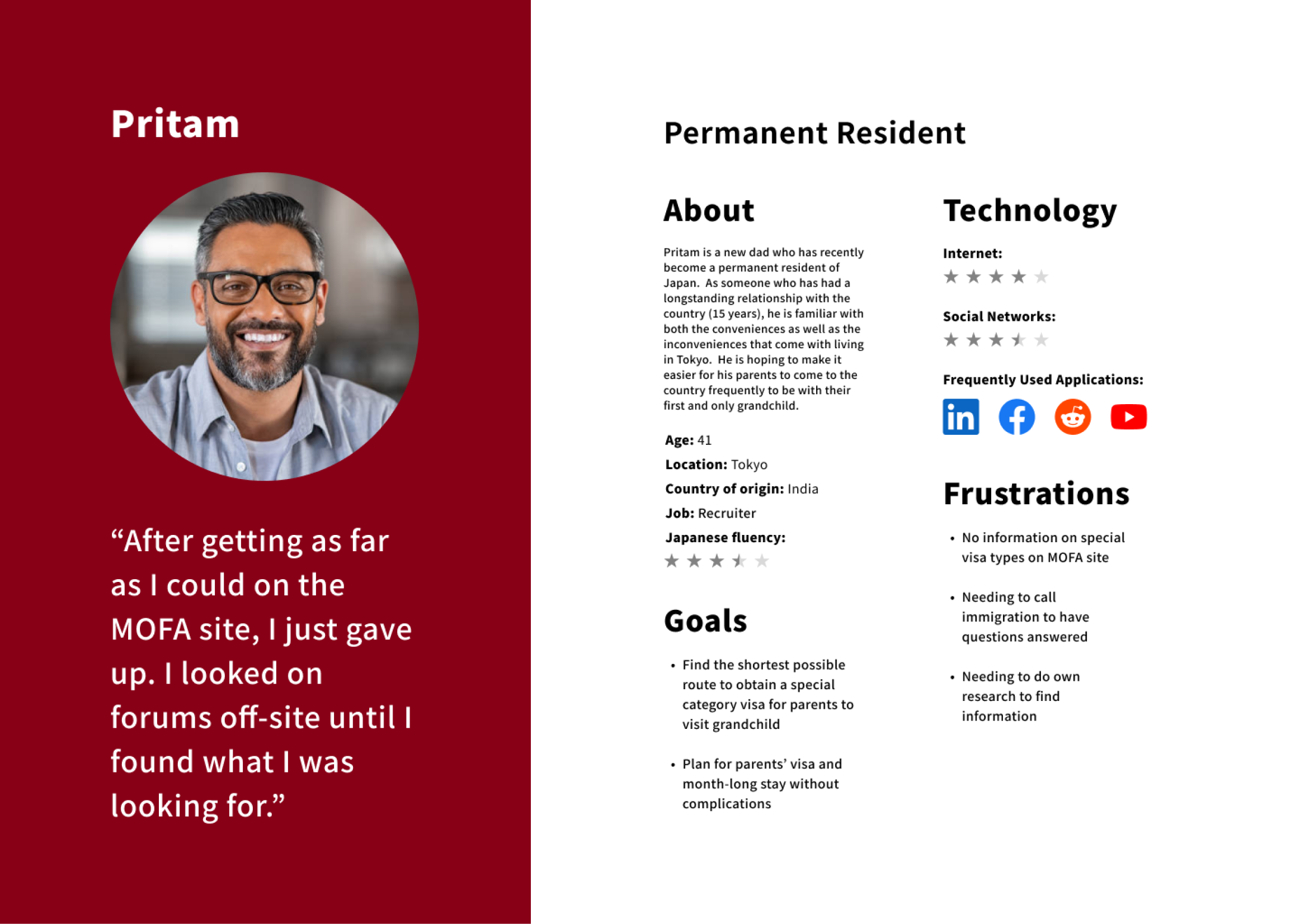 Permanent resident
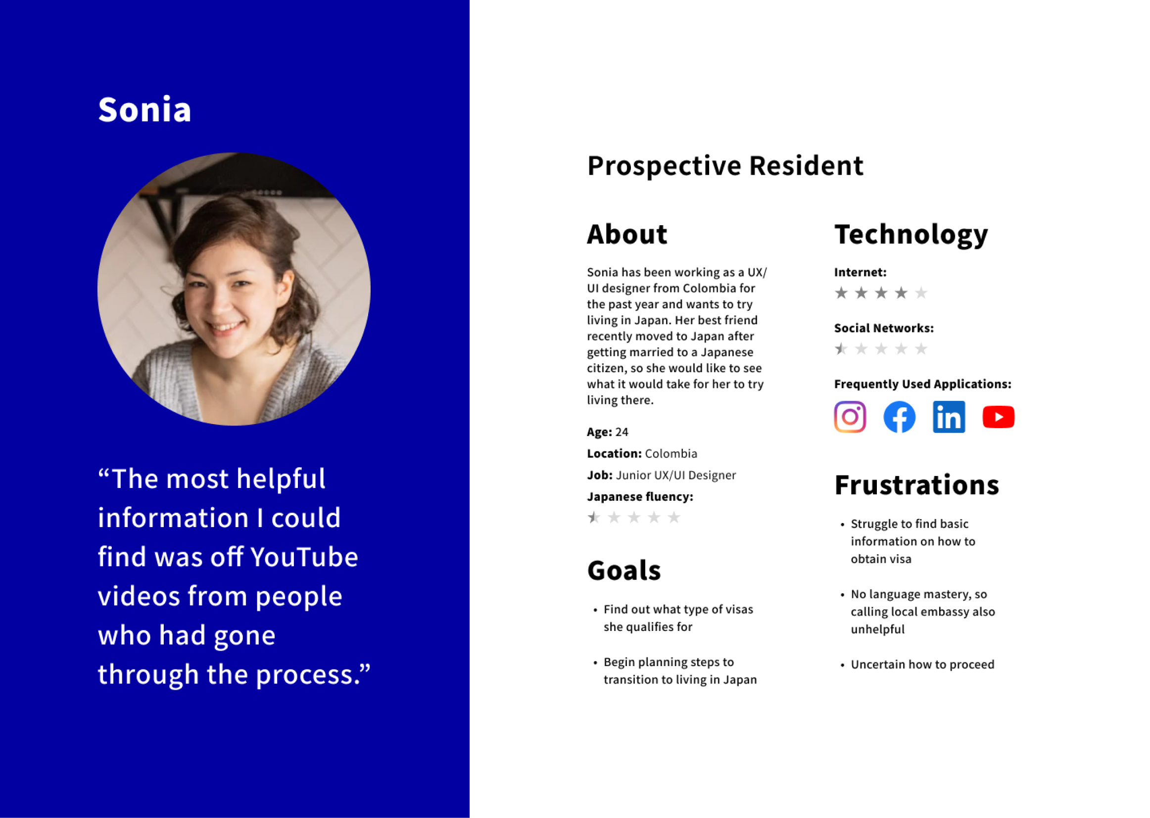 Prospective resident
Ideate
A clear search pathway
I began with a feature set to imagine what features might help ease navigation. I created a site map next to consider the site flow, followed by a user flow to determine how users would interact with the site. This redesign would change how users approach their information search, making the site work for the user instead of the other way around.
Feature set
The feature set centers the users’ need for clear, easy navigation from the visa landing page with access to help as needed.
 Feature set
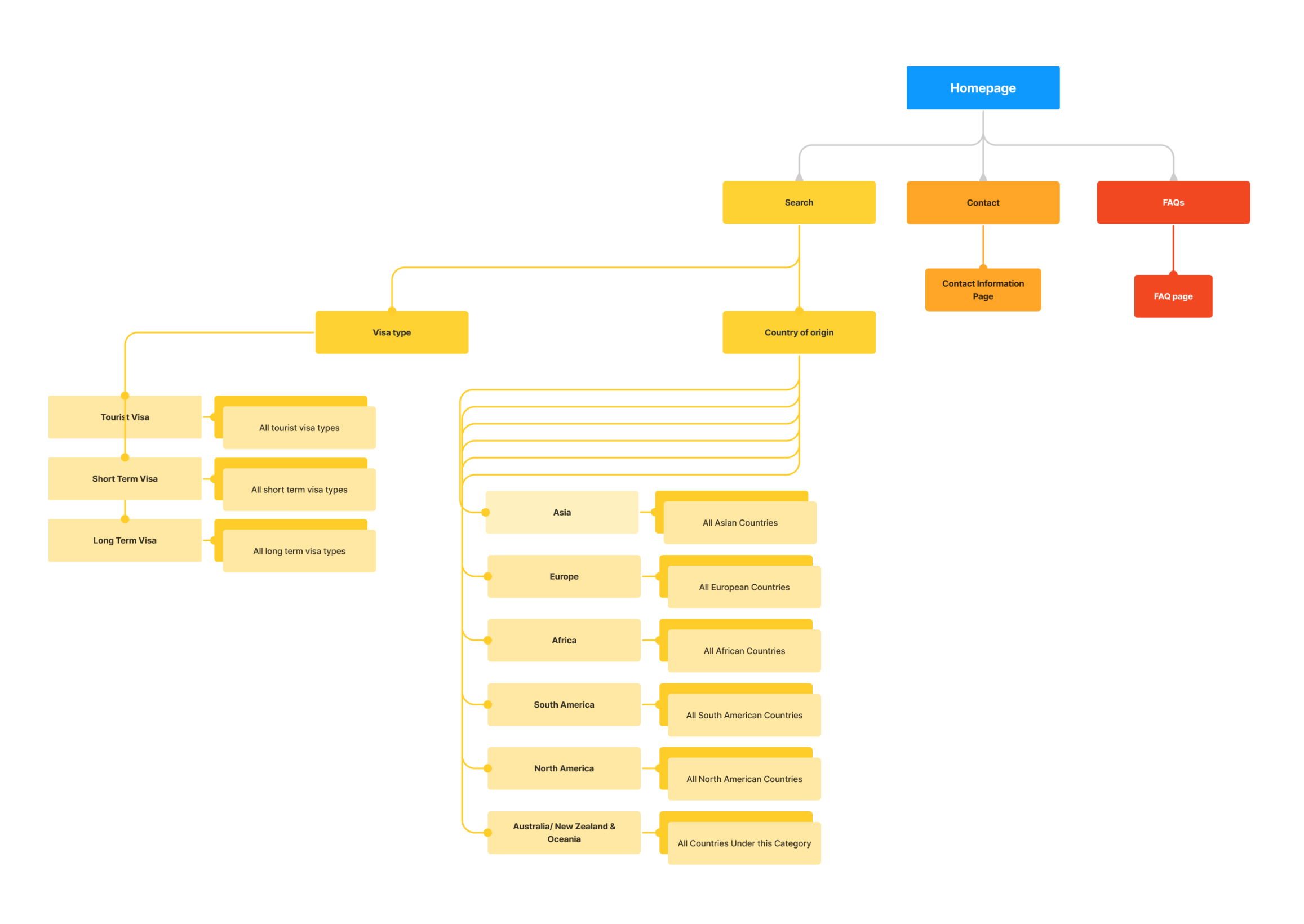
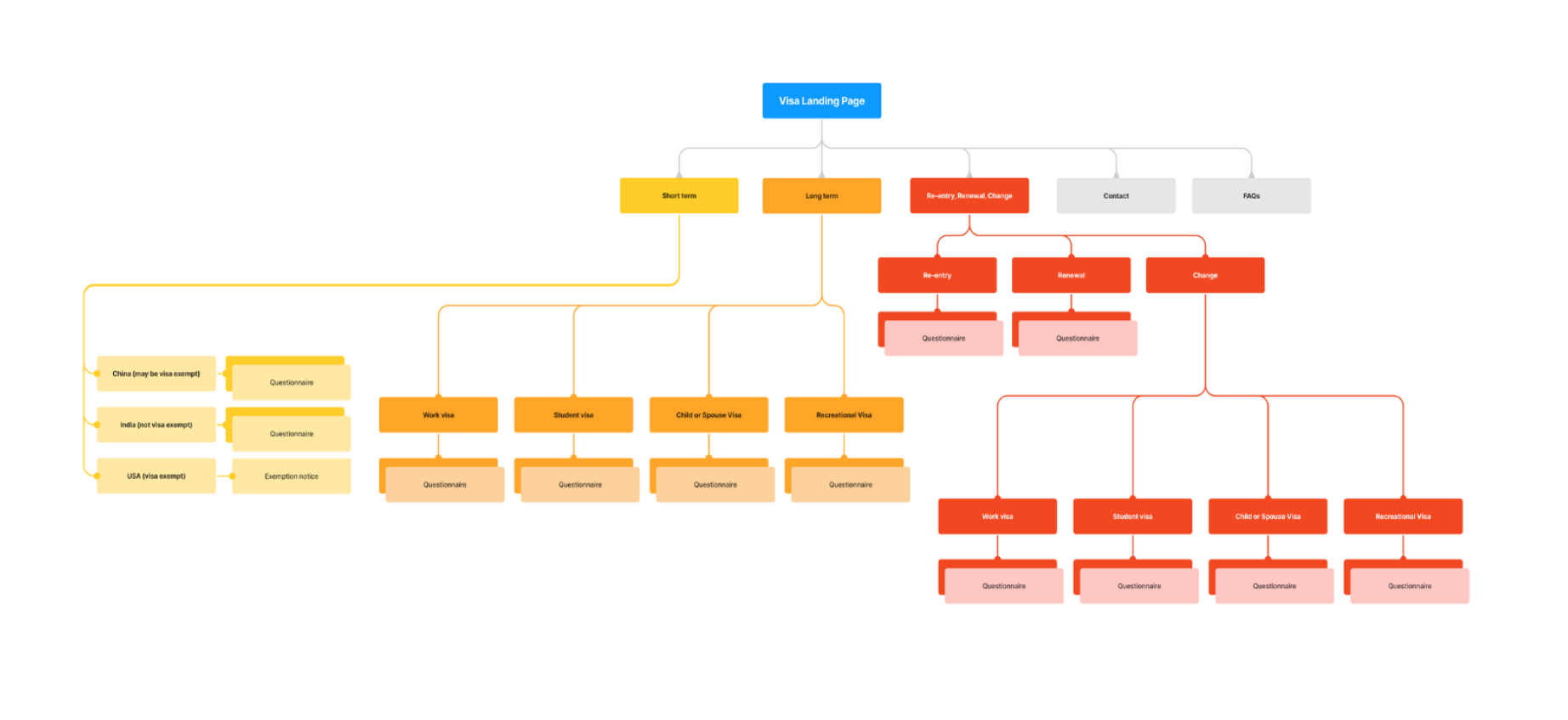
Site map
Usability tests indicated the user’s expectation to be able to search for visa information by visa type. This led to a site map that allows for visa search via country of origin and visa type. Other access points include contact information and FAQs, which would allow quick navigation in an information-heavy government site.
 Sitemap
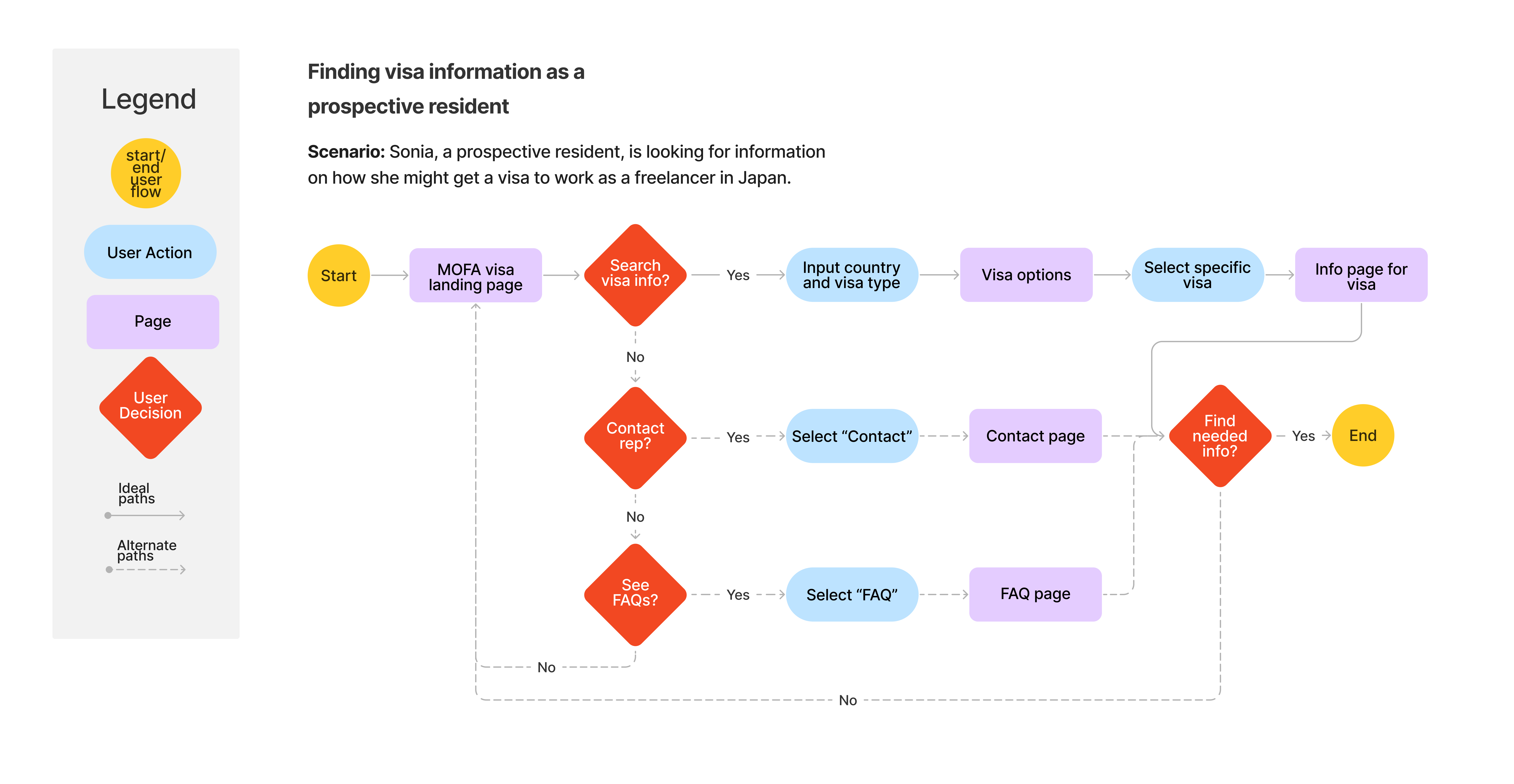
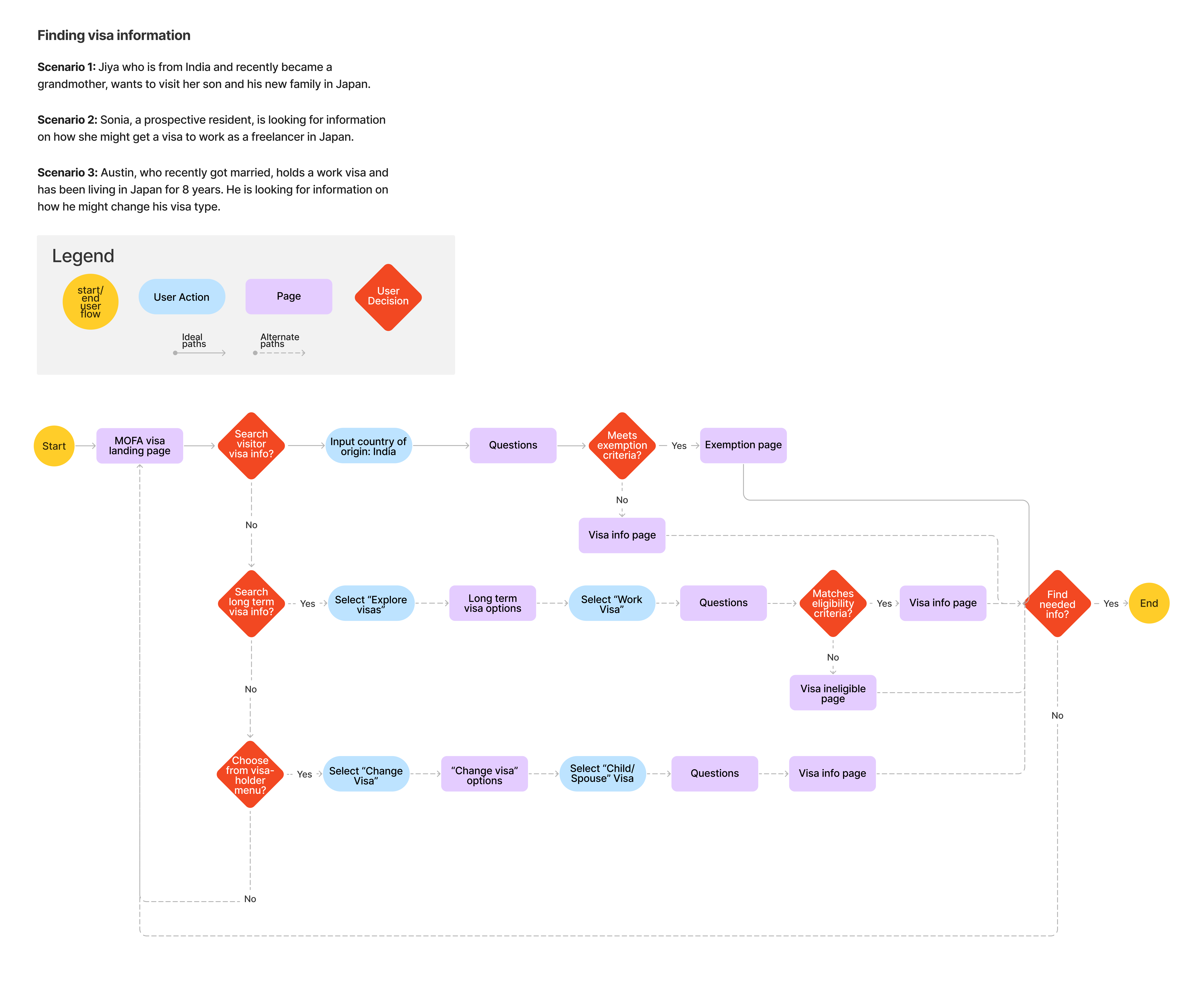
User flow
This user flow walks through the primary options users have access to from the landing page. It directs users along one of three pathways: visa search, contact a representative, or explore FAQs. Because there is a clear call to action from the landing page, users won’t need to spend time wandering the site for relevant information.
 User flow
The solution allows the site to work for users, not the other way around.
Ideate
Evolution of Wireframes
I began with low fidelity sketches to consider layout, based on patterns I noticed on effective government websites. In the mid fidelity wireframes, I considered categorization, flow, and content. Finally in the high fidelity wireframes, I was able to pair style with function, ensuring accessibility and clarity while creating visual consistency. Feedback on V1 of high fidelity frames led to an additional iteration that accounted for a third user type.
Low Fidelity: Layouts and Flow
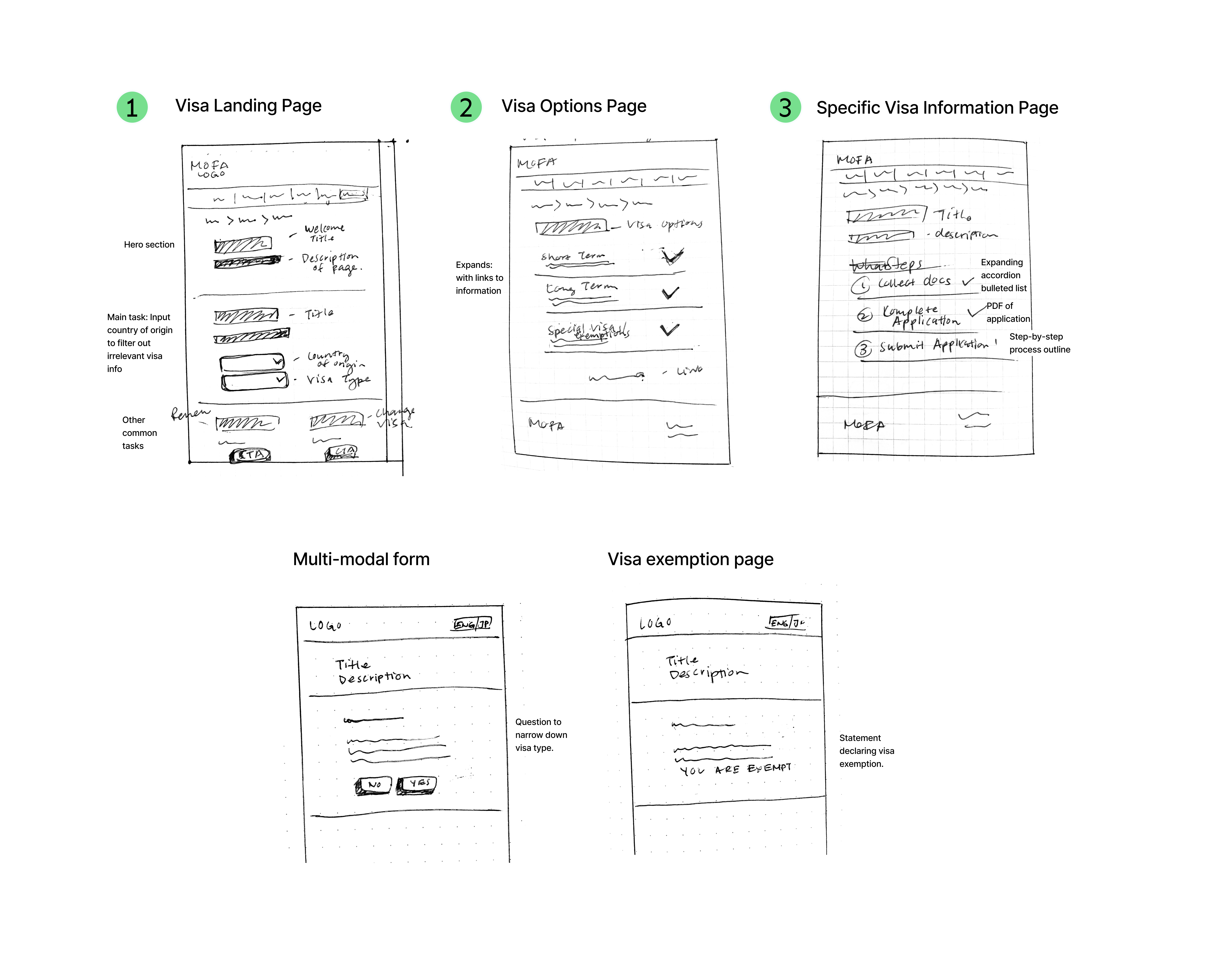
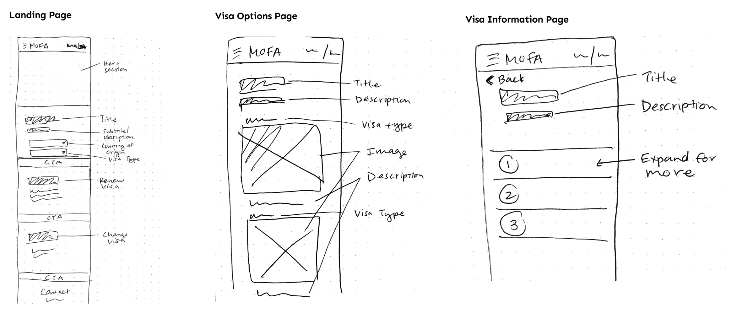
I began with low fidelity sketches to explore layouts for essential pages.
1. Visa Landing Page: I observed patterns used by effective government sites, including Singapore’s visa page and recognized secondary processes users might need to access. This led to my decision to make these processes (visa renewal, changing visa type) accessible from the landing page, while prioritizing new visas.
2. Visa Options Page: After narrowing down country of origin, users would be taken to the visa options page where they could read about and choose a specific visa type.
3. Specific Visa Information Page: Users would then be led to a page with all the information and documents needed for the visa they are applying for.
I later realized that the addition of multi-page forms could further lighten the burden of search for users. Based on yes or no responses, users would be led to instructions specific to their circumstances.
 Lo-fi frames for desktop
 Lo-fi frames for mobile
Improvements to flow in mid-fi frames
I introduced content in mid-fi wireframes and with it, attention to language, categorization, and user flow. Feedback on low-fidelity sketches prompted the question: how do I know if I need a visa or not? This led to the creation of two distinct visa categories: short term visa and long term visa with special attention paid to explanations for each visa type. Multi-step forms were introduced here with pathways that followed from these categories.
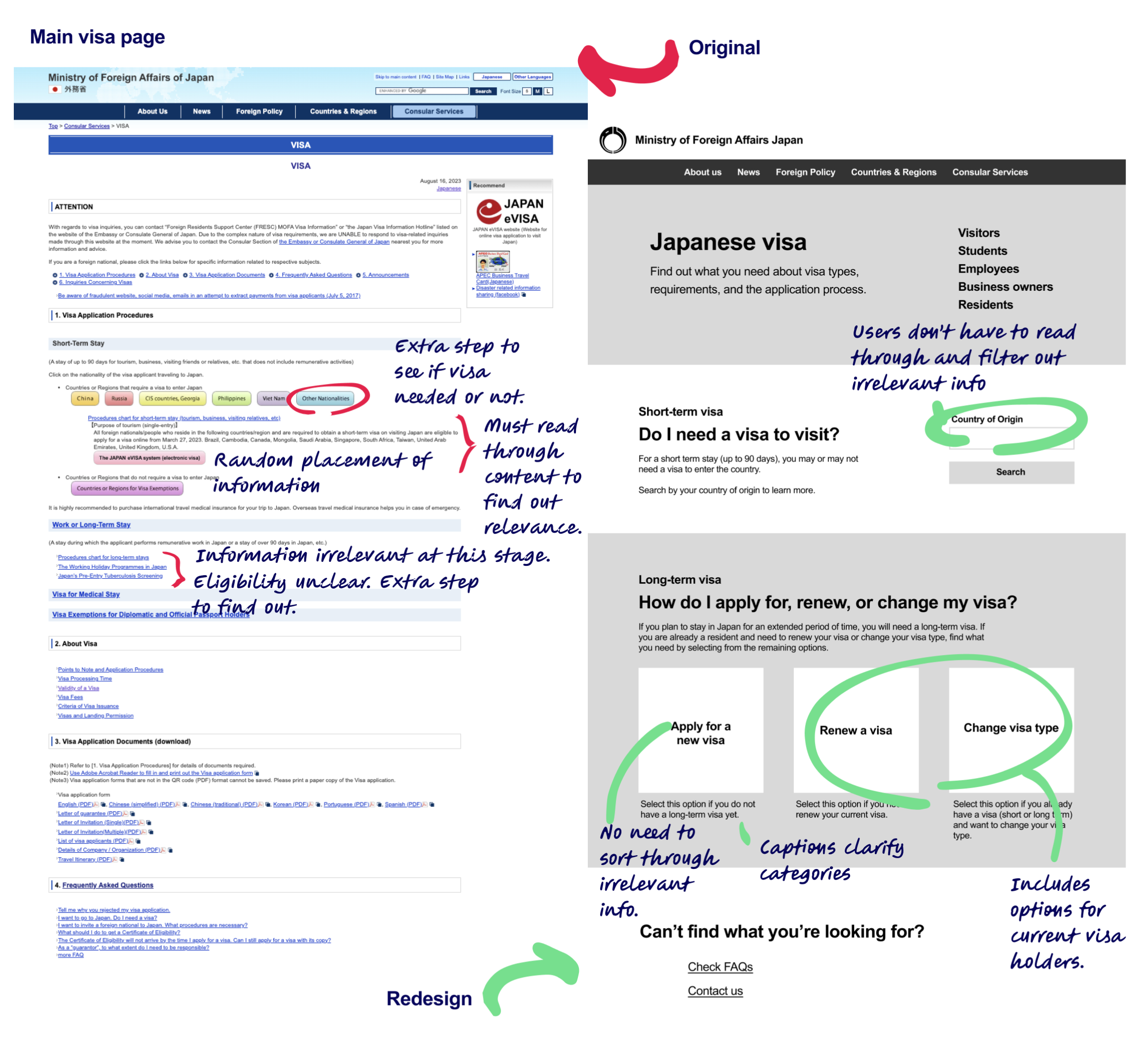 Main visa page
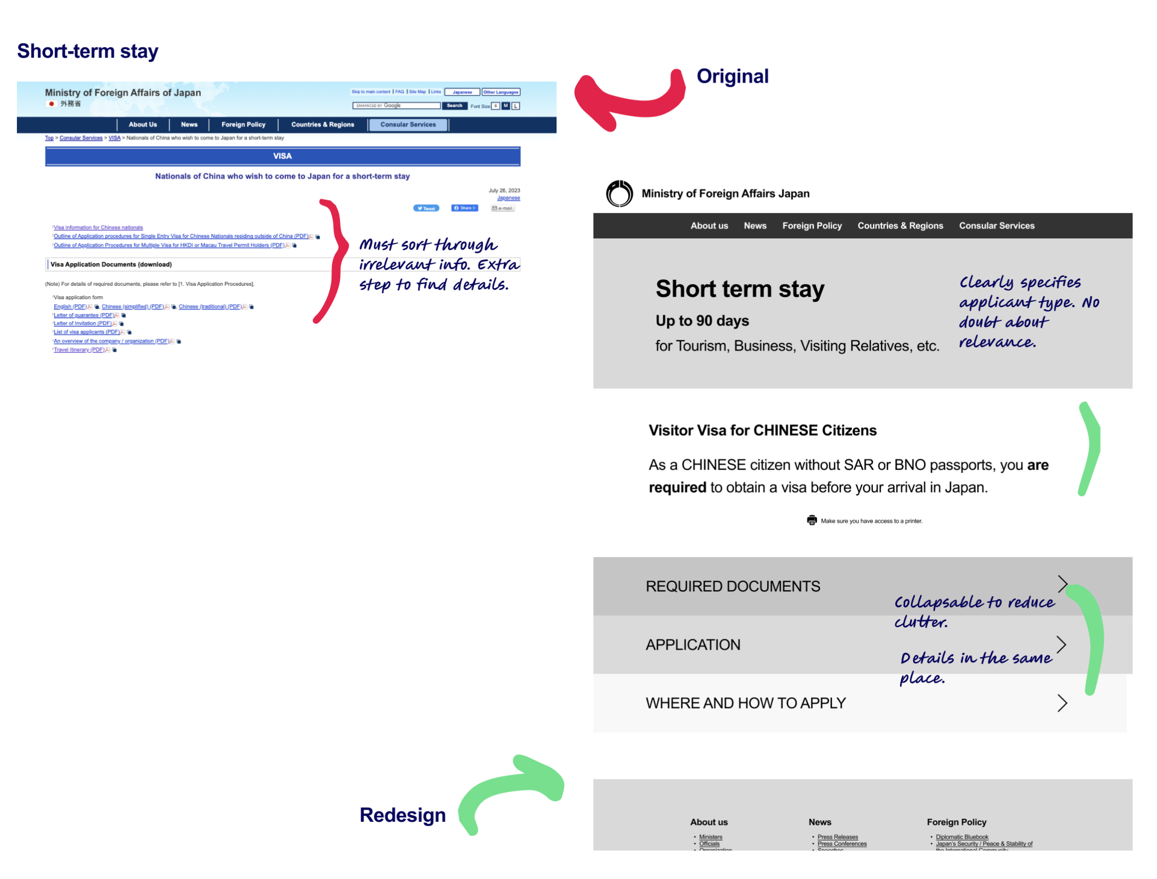 Short-term stay page
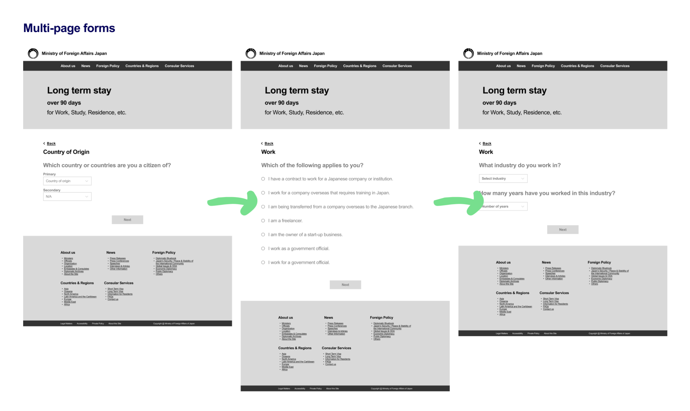 Multi-page forms
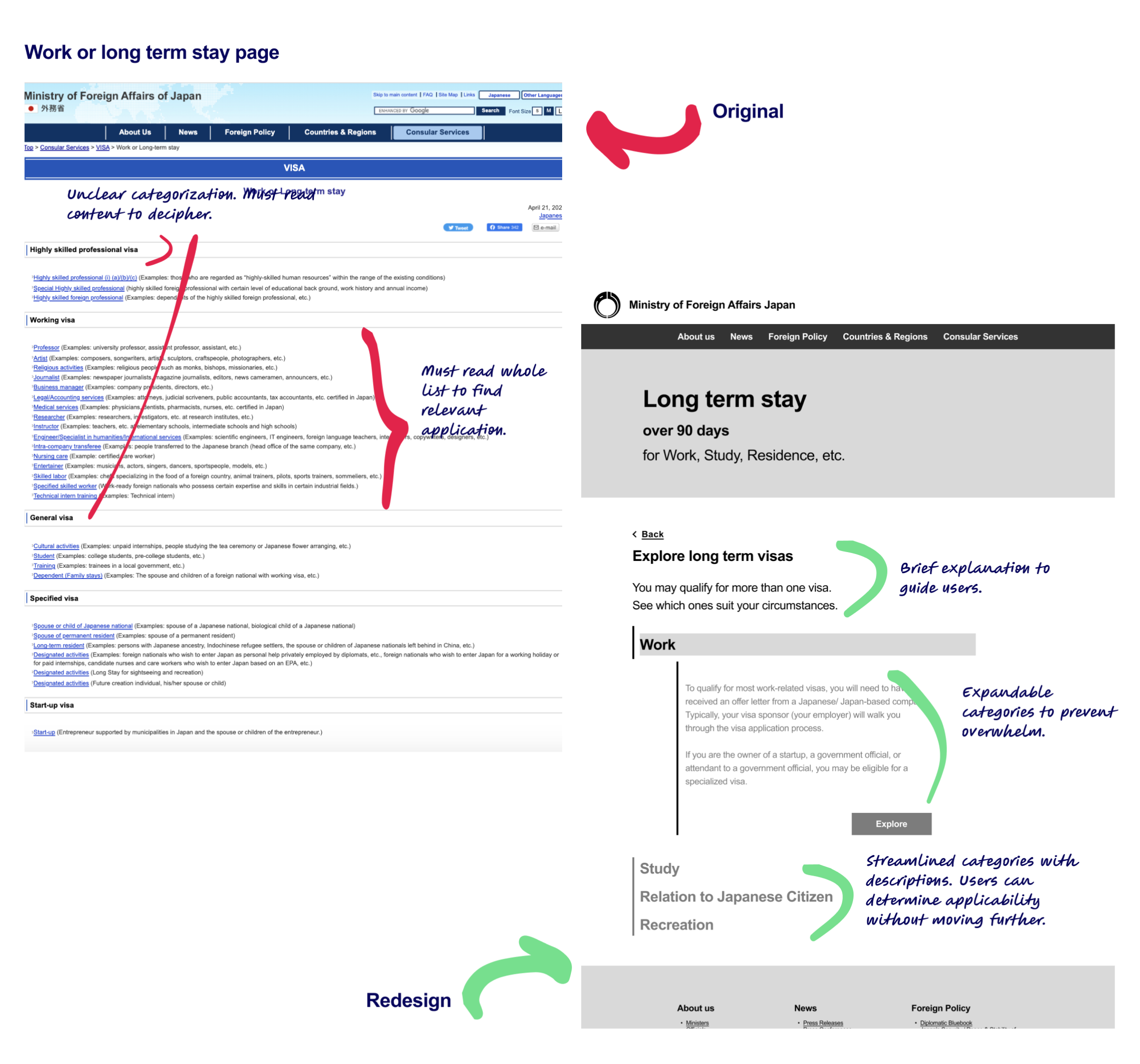 Long term stay page
High fidelity: V1
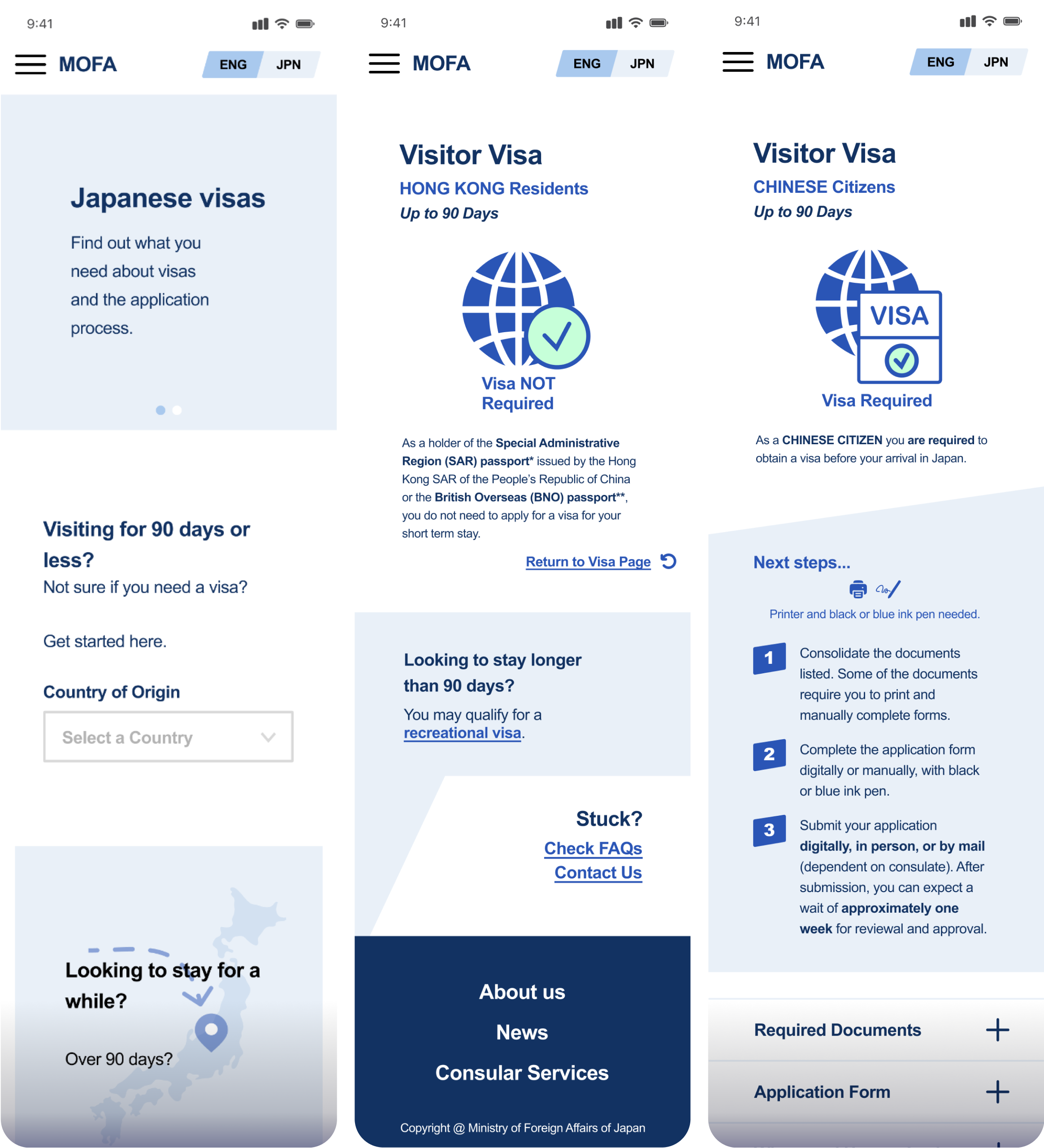
The high fidelity wireframes consider how style pairs with function. Images were added to break up the text, the footer was further streamlined, and I matched colors and fonts with the original site to maintain branding.
1. Pathways based on user needs: Based on the initial personas, I created search pathways for users seeking a short term, visitor visa and a separate section for users seeking long-term visa information. Distinct, color-coded labels lead users down the pathway most relevant to them.
2. Search results based on user profiles: Users are given information that is relevant to their specific circumstances. With this flow, users do not have to question the validity of the information they find.
3. Fleshed out accordion menu: Users have access to documents they need, an application in multiple languages, and specific details on the application process. Users do not have to leave the page to crosscheck information.
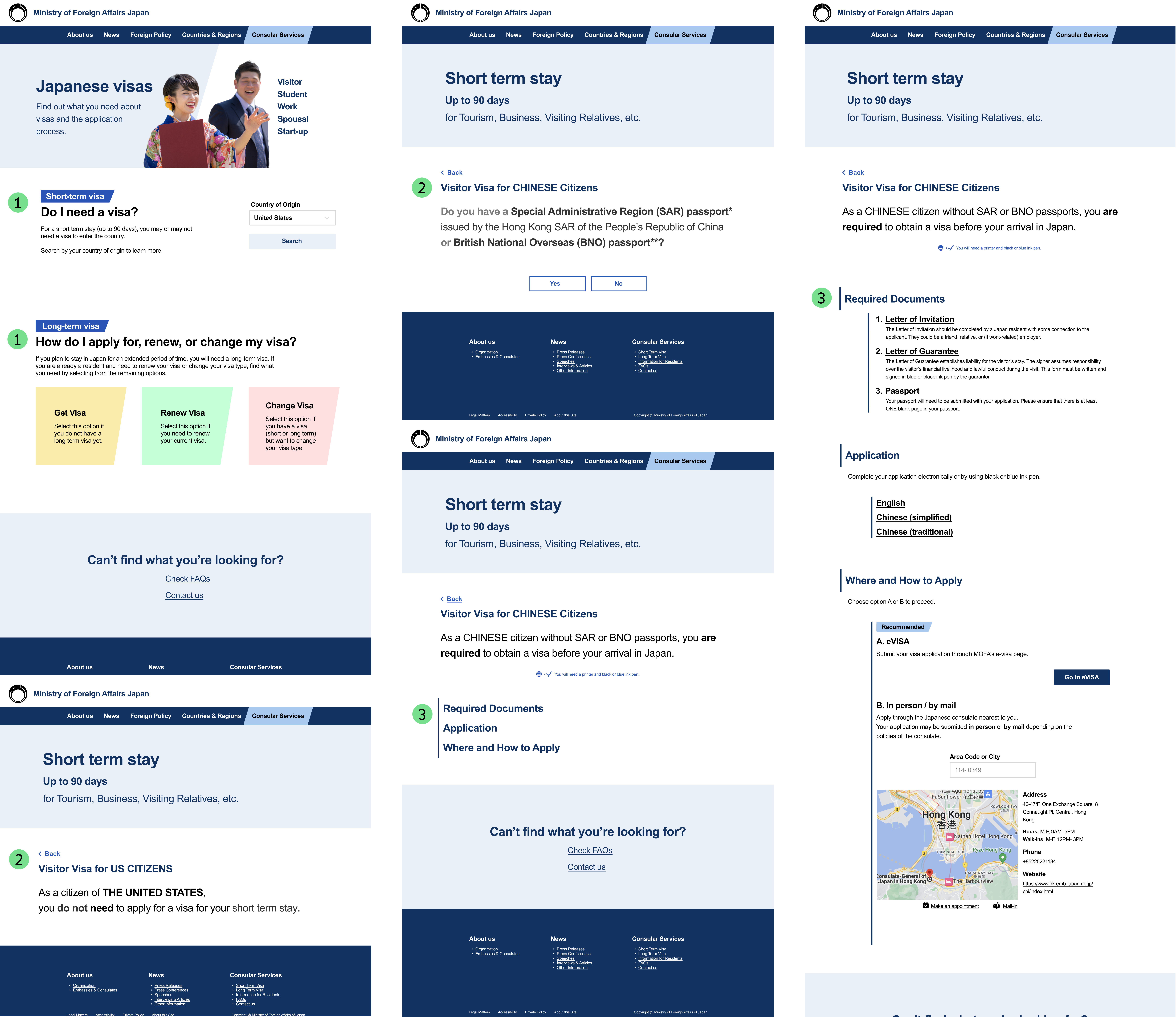 Hi-fi frames
Iterations: a third user and even clearer categories…
After receiving feedback on high fidelity iterations, it was clear that categorization could be even clearer if I accounted for three distinct user types: the short term visitor, the prospective resident, and the current resident. I iterated on personas, site map, user flows and high fidelity frames to account for three distinct users and flows.
The addition of a third user type improved organization and usability.
Deliver
Smooth new flow
After a couple rounds of iterations, I was ready to test the prototype. Usability testing revealed the success of the website’s new flow and information architecture. The main revisions I would need to make involved the visibility and clarity of content.
Usability Test
Usability tests were conducted with three participants, two current Japanese residents and one US citizen with an interest in living and working in Japan. Users were given hypothetical scenarios and prompted through flows.
Usability Test Findings
Users found the redesign to be clean and easy to navigate.
- Avg. 5/5 easy to navigate
- Avg. 5/5 confident about applying for visa
- Visibility and clarity of content caused users the greatest pause.
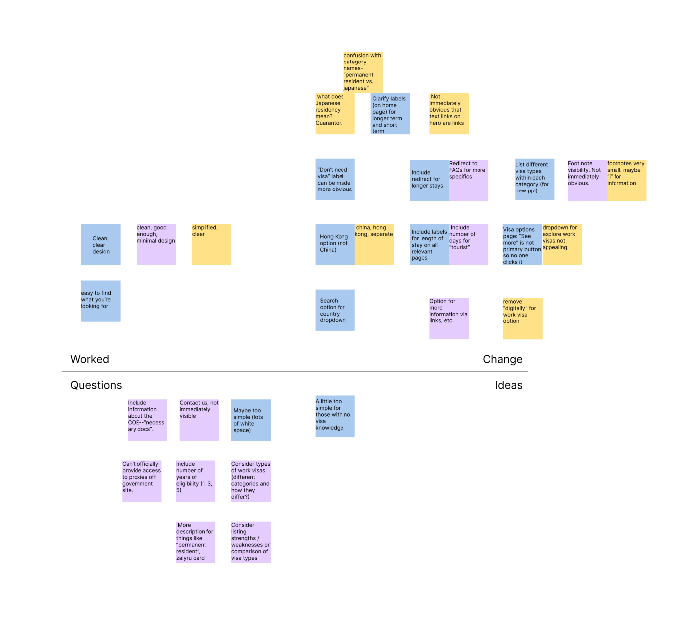 Affinity map with usability test findings
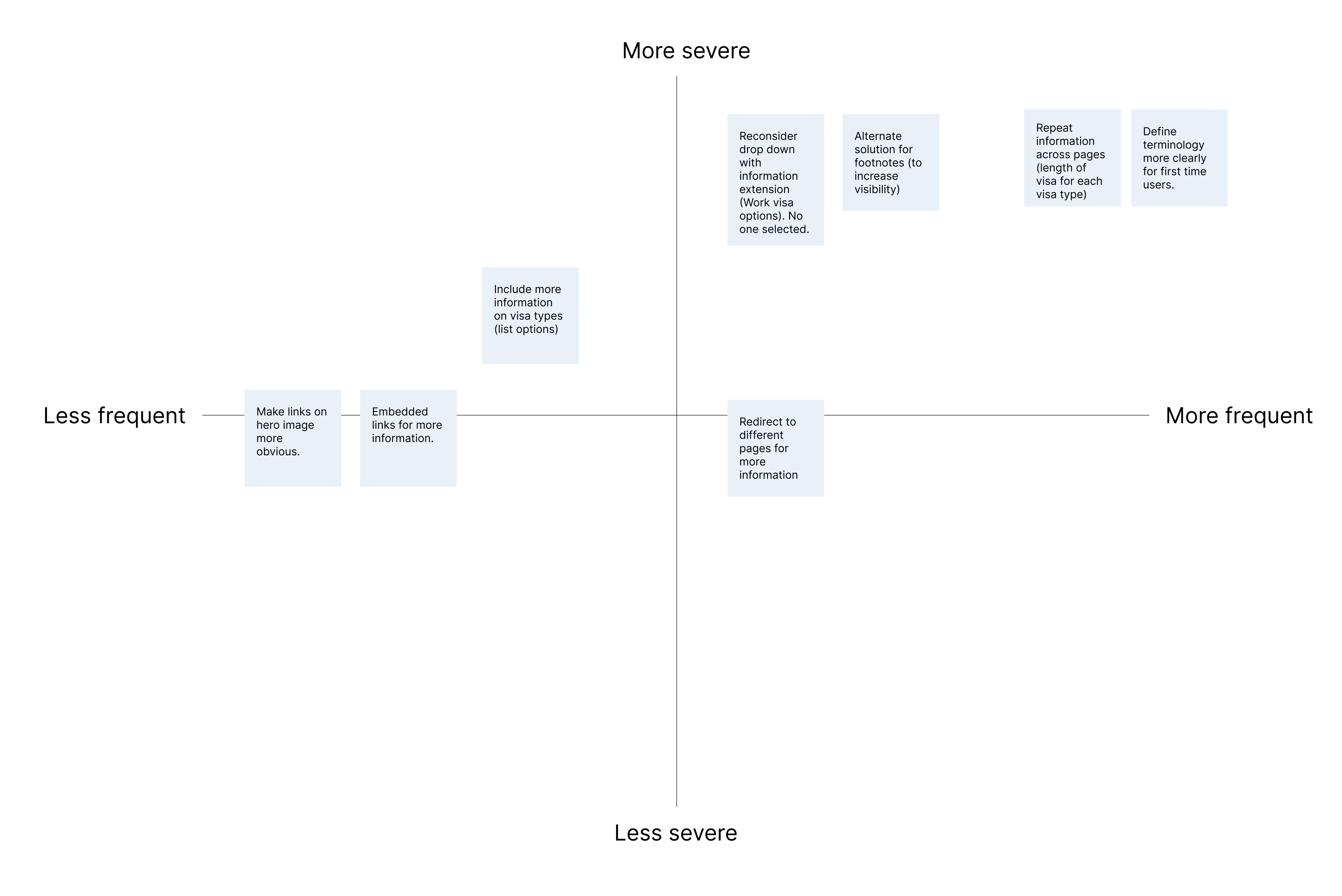 Frequency-severity map
Priority Revisions
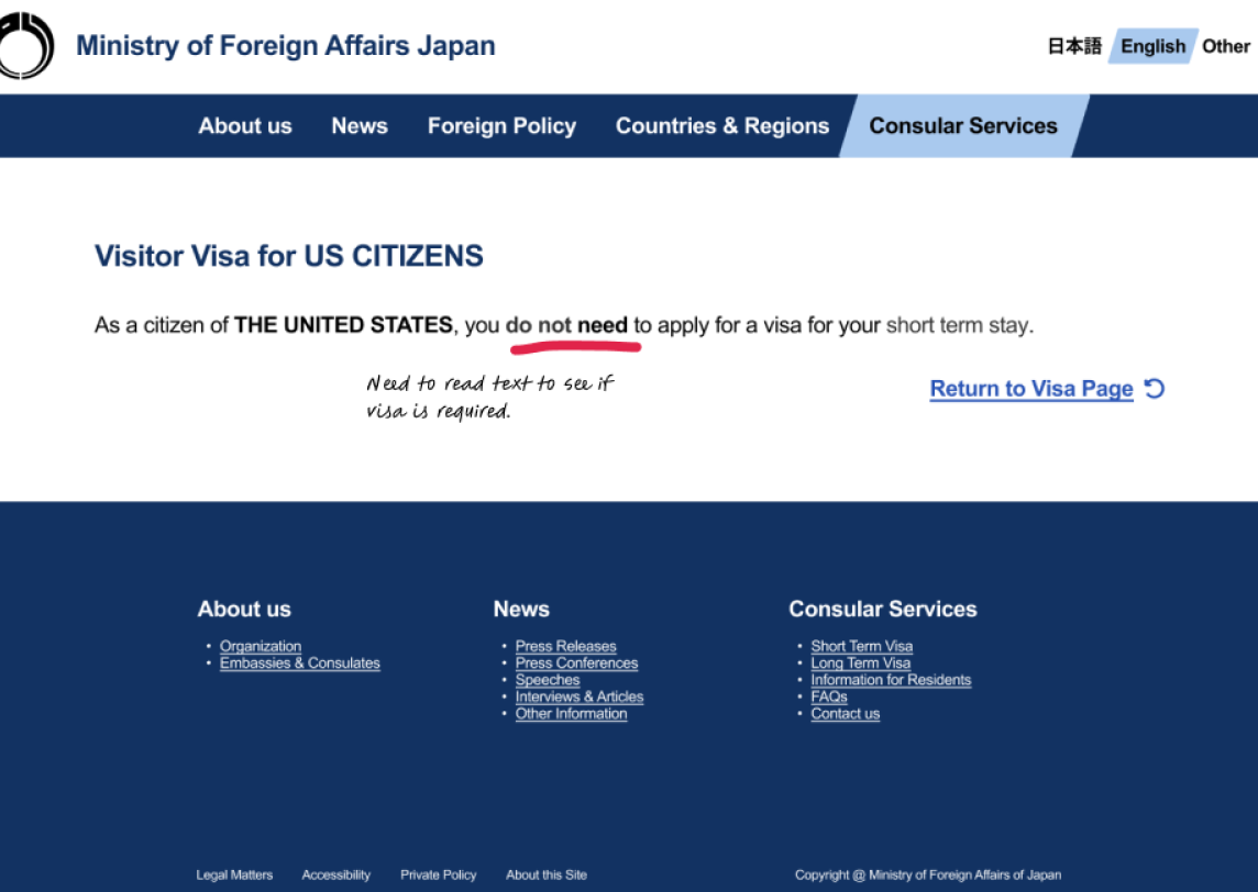
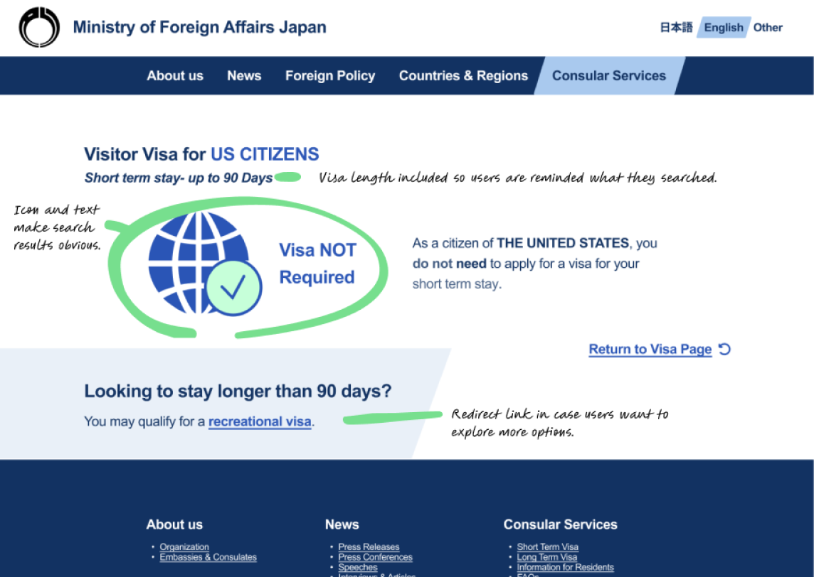
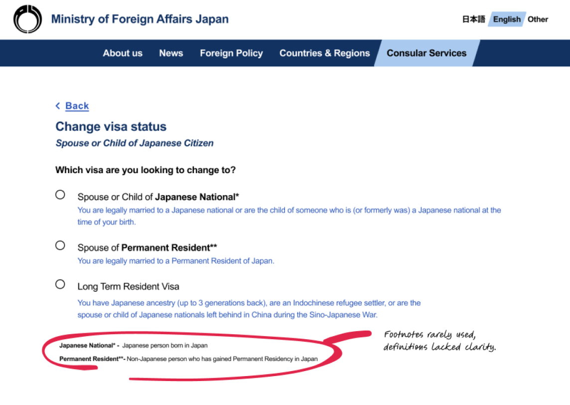
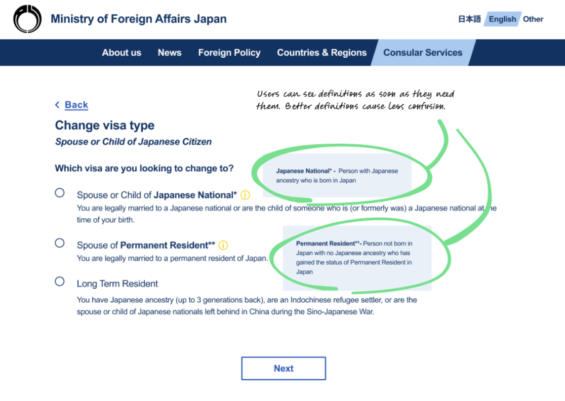
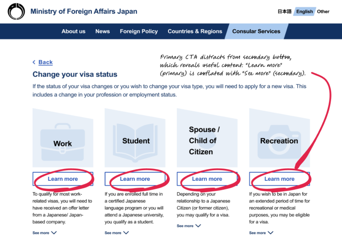
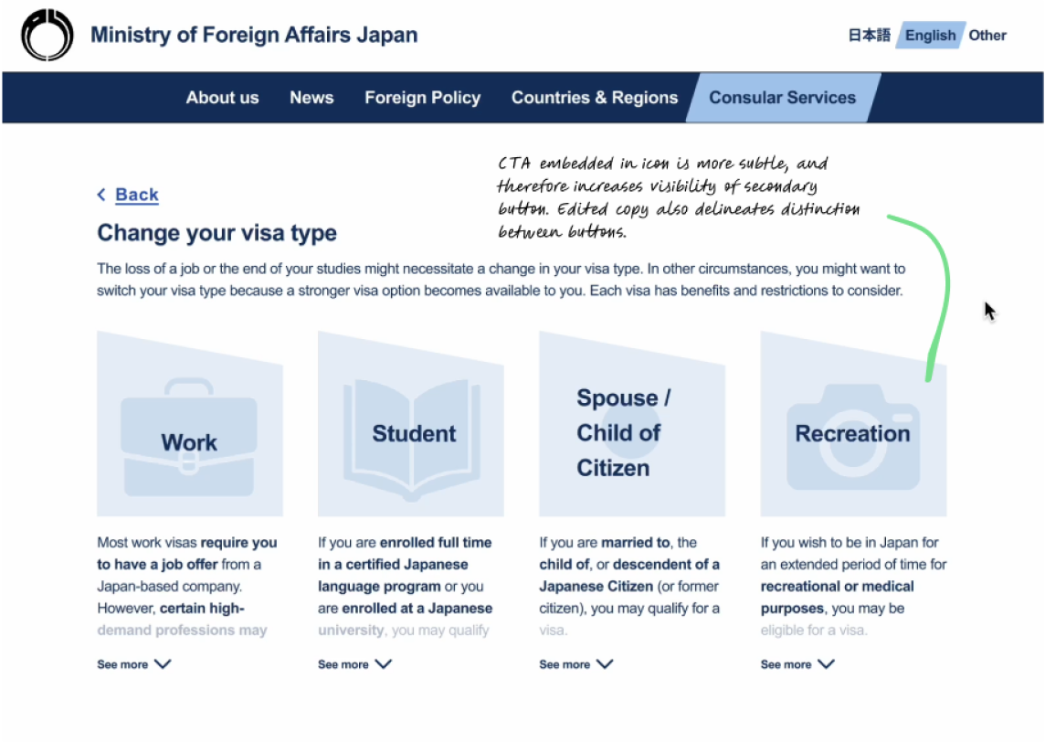
From usability tests, the biggest iterations I would need to make involved increasing visibility and clarifying content.
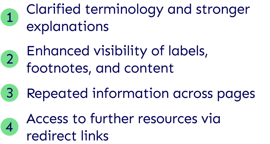
Version 1, Visa Results Page
Version 2, Visa Results Page
Version 1, Spouse/Child Visa Options
Version 2, Spouse/Child Visa Options
Version 1, Change Visa Status Options
Version 2, Change Visa Status Options
Hi-fi mobile frames
Final Prototype
 Click here to see final prototype
Conclusion
Moving forward and given further resources, I would speak to industry professionals to better understand the complexities of visa applications. I would find out all the potential use cases to ensure there is a pathway for every type of user. Further down the line, an online application portal would further enhance the user’s experience with visa applications as well as reduce the workload of immigration agents who are hand-processing hundreds of paper applications daily.
In my own reflections on this project, I would have started with heuristic analysis as part of my initial research to be able to reference tangible UI elements that make the original site ineffective. This would have been a quick, time-effective way to define the problem. Additionally, I would have liked to spend more time defining personas, taking into consideration all potential users of the site. This may have saved steps in ideation.
Overall, this project helped enhance my understanding of how to create hierarchy and clarity in a complex system.
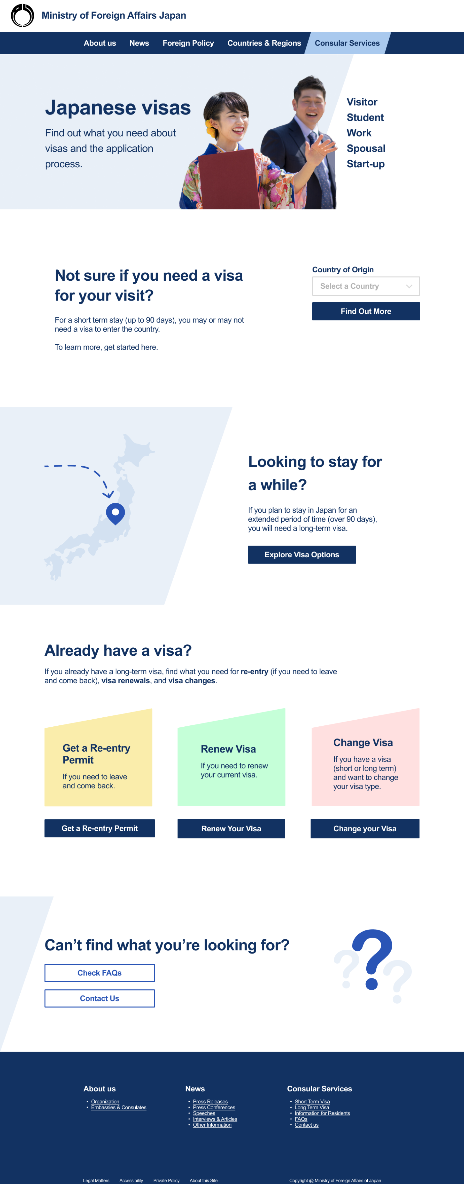 Hi-fi landing page v2